Practitioner work
Dancing Events Poster Design
I decided to look at various posters related to dance events that could link to Jas’s class and how they could represent the atmosphere that could be felt during these events. I wanted to look more closely at how the typography has been used here in original ways, not only through the font but also through their placement. I found these inspiring for my project, especially as I find it hard to create typography for dancing because it is so loose and free-flowing. Maybe it is because I have more space to be creative with it. But looking at these posters to see how they can define a particular era, culture, and dance movement was insightful. The posters are not animated, but they still bring forward the loudness of the events and the movements of the dancing. It was also interesting to look at three posters for three distinct musical movements: rave, Funk and Bollywood dancing. It could be interesting to represent different movements that can be felt during Jas’s class.

I looked up posters representing Indian culture reminiscent of Jas's dance experience as a Southeast Asian. This poster for the Bollywood movie "Utsav" is about a courtesan named Vasantasena who dances for the king and tries to escape his brother's advances. The typography used for "Utsav" is reminiscent of the 60s font with its curves and boldness, which represent the hand gestures and movements performed during the dances. It reminds me mostly of how the hands move in a way similar to sign language to help tell a story during the Bharatnatyam. The font has a retro aspect to it and brings forward the rich history of Indian cultural dances. There is an illustration of Vasantasena in the background, juxtaposed just above the name, representing her importance to the movie plot. This poster captures the essence of Indian culture well through its use of typography and red and orange colours.
T.W Kelly on Pinterest
This poster truly encapsulates the atmosphere of the 90s rave culture. The background imagery has an uncanny feel to it, with a woman’s face, which seems to be a robot coming from our generation emerging from the ground from what seems to be another dimension, genuinely capturing the cyber cultural trend from the time. The typography for the title of the event, “Fantazia Takes You Into”, and 1992 is experimental and seems to be sucked in giving a literal representation of the sentence and out-of-word experience that the attendees will have in joining this subculture. The delicate and sharp lines used for the font here make the poster look even more futuristic because of its modern approach.

Fantazia, Perkins &Griffin, 1992

This poster by Nathaniel Winter Hebert, "Jump' n Funk," celebrates the music of the late great Fela Anikulapo Kuti. The typography for "Jump' n Funk" represents the accurate movement of the dance style through the different sizes and shapes, which are reminiscent of the rhythmic and expressive nature of funk dancing.
The photograph of Fela Anikulapo Kuti has been cut out and retaped onto the poster, giving it a DIY feel that is reminiscent of the rebellious aspect of Funk music.
Nathaniel Winter Hebert, 2014
Boxing Event Poster Design
When I look at boxing posters, the sound of the crowds which will be cheering them can be felt through it because of the size and the weight of the typography. But what else brings forward the sounds of the crowd roars, the boxers grunts and breathing, broadcast commentary, the bell ringing, and the referee commands?

Ali vs Frazier Event Poster 1975,
No Name
At first sight, the big, bold letters spelling out "Ali" and "Frazier" bring a sense of immediacy and familiarity to this poster from 1975 as it is instantly recognisable to fans. The font chosen here is geometrical, bringing a sense of violence reminiscent of sharp edges. This font is cut in some parts, reminiscent of the cuts and bruises from a fight. The font used on this poster contrasts with an expressionist painting from Leroy Neiman, which enhances the dynamism of the sport through bold brushstrokes, vibrant colours, and exaggerated forms. I also found it interesting how the typography is entering in a way the painting bringing forward the loud aspects of the boxing match as if it could not contain its sound.
This poster for “The Rematch” between Pryor and Arguello from 1983 is punchy through its use of a black background and white, gold, and red lettering. The scene which will be set can already be felt through the straight lines and the red and black gradient used for the font of “The Rematch”. The crips sharp edges of this font bring forward the seriousness and importance of attending this match. Most of the fonts on this poster are enlarged, giving it a sense of oppressiveness and anxiousness. The types are very close together, almost touching each other, and there is a feeling of claustrophobia, which gives in to the pressure of attending the Rematch. The placement of the illustrations of Pryor and Arguello fighting above the title adds a sense of drama to this poster.
This poster is also reminiscent of the Godfather’s poster, known for its portrayal of masculinity, authority, and power, which adds intrigue and importance to this boxing poster.

Prior vs Arguello Event Poster, No Name

This poster for the boxing match between Muhamad Ali Clay and Oscar Ringo Bonavena is attractive as the expressive type used here is placed above a red line, miming the structure of a boxing ring. The colours which have been chosen are also reminiscent of a "Boum" onomatope, which could be seen in a comic strip. Using these colours brings forward the energy and impact of a punch landing. Bringing this imagery above both boxing champions reinforces the noise that will be omnipresent during the match. It flattens the back of the image, directing the viewer's gaze and reinforcing the importance of attending this boxing match at the Miami Beach Convention Hall.
Clay vs Bonavena, 1970, No Name
Paula Scher
Type as Image (2023)

Type as Image, Scher, 2023

Type as Image, Scher, 2023
Paula Scher, an American pioneer in graphic Design, has her work exhibited at Die Neue Sammlung in Munich. Her typographic Designs are showcased on the floors and on the museum's walls. I really enjoy her work as it immerses the visitors into typography instead of having it simply as a poster on the wall. In her work, type becomes the images; using large fonts to surround the visitors, she enables them to understand the true powers of type and that illustration is not needed to convey a message. It can be expressive through its shape, size, placement, and vibrations. The words seem to be dancing in the space and have a similar feel to the internet data coding, all whilst keeping in balance. “Type as Image” also shows the true potential of fonts from being something physical that one can touch, can even go inside of, can walk on, it is multi-sensorial.

"Bring in Da Noise, Bring in Da Funk", Scherr, 1995

Springsteen Darkness on the Edge of Town, Scherr, 1978
I have always been drawn to her work from her poster Bring in da Noise Bring in da Funk," which uses typography to express the noise found in the streets of New York by playing with weight, margins, and typefaces. Her cover album for Bruce Springsteen, "Darkness on the Edge of Town" features flawed, imperfect typefaces reminiscent of the typewriter machine to represent perhaps a more humane and vulnerable aspect due to the craftsmanship of the medium, which is reminiscent of Springsteen's songs. In her works, she "Plays with her design", which is childlike and Gambling. In the Ted Talk "Great design is serious, not solemn" she explains that "if you are a designer and you are not playing, there is something inherently wrong with you." (Scherr,2008) Her work inspired me to play with typefaces, completely replacing illustrations. Moreover, she pushed me to do so, saying, "To grasp design, you have to be unqualified for the job." (Scherr, 2008) Which was a slight relief for someone who wants to try out this new element of Design and pushed me to play with it in my own way.
Local Heroes
Rocio Alvarez
2023

Local Heroes, MIMA, 2023

Local Heroes, MIMA, 2023
Photographs from the exhibition at the Mima in Brussels from May 2023 celebrated the boxing sport, its history, society and culture and how it brings together the communities of Brussels. I was primarily drawn to the work of Rocio Alvarez as it celebrated the boxing champions and brought forward female boxers. Not many posters showcase female boxers, so it was nice to see them being brought to the front. The layout of her exhibited work is playful and draws people in through the use of colours and collage style placed on the walls. It is also interactive through the arcade game machines showcasing the playfulness of the serious sport. This inspired me to start looking at ways I might make my work more playful for my audience and how it could showcase the sport's playfulness using unexpected materials and unconventional layouts to showcase my work. This made me think that maybe I could create some game which showcases the spirit of boxing and dancing, inviting the audience to manipulate the letterforms, for example.
Thinking of You.
I Mean Me.
I Mean You.
Barbara Kruger
Serpentine South Gallery

As part of my research, I went to see Barbara Kruger exhibition “Thinking of you. I mean me. Me mean you” at the Serpentine Gallery. Barbara Kruger practice is made from photographs taken from different media sources which she enlarges, crops, and juxtaposes with bold verbal statements. Through her work she challenges the notion that society dictates our thoughts, attitudes, and desires. (Kruger, Linker, 1990, p.12) Through the use of the visual language through private and public spheres, Kruger undermines their influence and authority and brings forward an enlightened understanding. (Kruger, Linker, 1990, p.12) Through her creations, the images and text are in harmonious interaction, the text brings forward the subtle elements which could be understood through the image.
Influenced by movies, televisions, and stereotypical situations and by using language and imagery derived by other contexts, Kruger is “developing a culturally informed practice that eliminated the personal elements for art making”. (Kruger, Linker, 1990, P.16) By repositioning them within a critical context, she encourages viewers to question these ideologies and narratives that shapes meaning within our society.

Exhibition Details, Kruger, 2024
Thinking of You. I Mean Me. I Mean You. Kruger, 2024
This exhibition was very interesting for my project as I wanted to explore the ways in which practitioners work with typography and make it the central piece of their work.
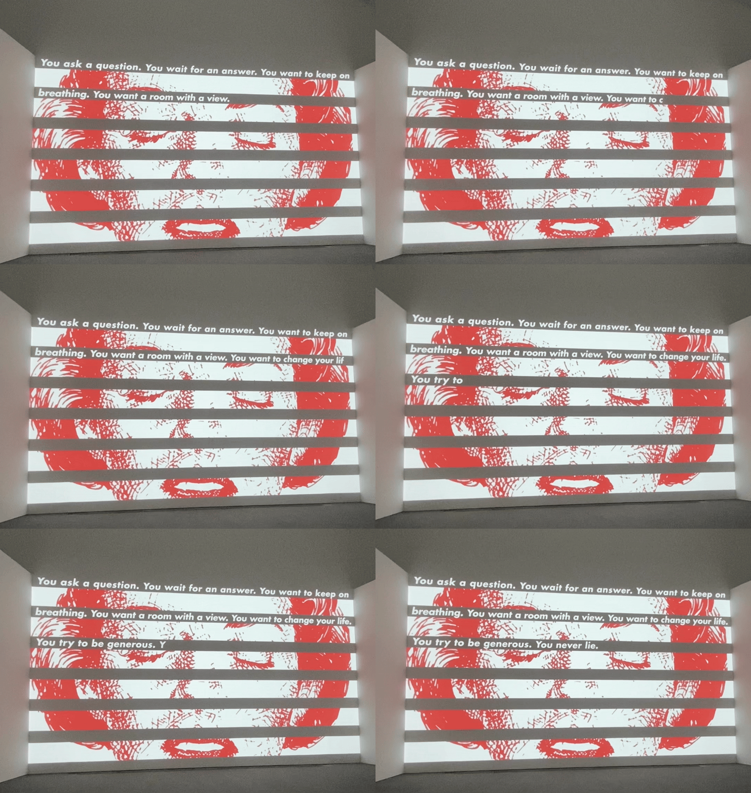
For her exhibition, she created moving images by re-using some of her well know central pieces including Untitled (Stripe 1) from 2019 which she remade as moving image where the text “You ask a question. You wait for an answer. You want to keep on breathing. You want a room with a view. You want to change your life. You hope for the best but fear the worst.” (Kruger, 2019) dynamically passes by through the black stripes above of the image.
The image was still the whole time, but the text was doing “the talking” and bringing forward the questions of identity which is something that I found interesting as the text usually has a secondary role.

Thinking of You. I Mean Me. I Mean You. Kruger, 2024

Thinking of You. I Mean Me. I Mean You. Kruger, 2024
In another room, she had positioned her famous sans serif calligraphy text all over the walls and even on the floor in an interactive piece. Some of the text read “You are here looking through the looking glass, seeing the unseen, the invisible, the barely there. You. Whoever you are. Wherever you are. Etched in memory. Until you the looker is gone.” Again, she brings forward this sense of individuality through the word “YOU”, by using capital letters in a sans serif font which she forces the viewer to step on, she brings forward the sense of urgency in understanding their own identities and their place in society. I found this piece to also be quite compelling even if it was static, it still forces the viewer himself to move around it, which could also be an interest thing to think about for my project and how I could make the viewer move bringing forward the efforts made during the sports of boxing and dancing.
I found her work to be interesting and it made me think about how I could challenge these notions of communication through my work for this module.
Anna Mills

From "How to Transform Static Words into Beautiful Moving Type" 2023

Anything can B a B 2020

From "How to Transform Static Words into Beautiful Moving Type" 2023
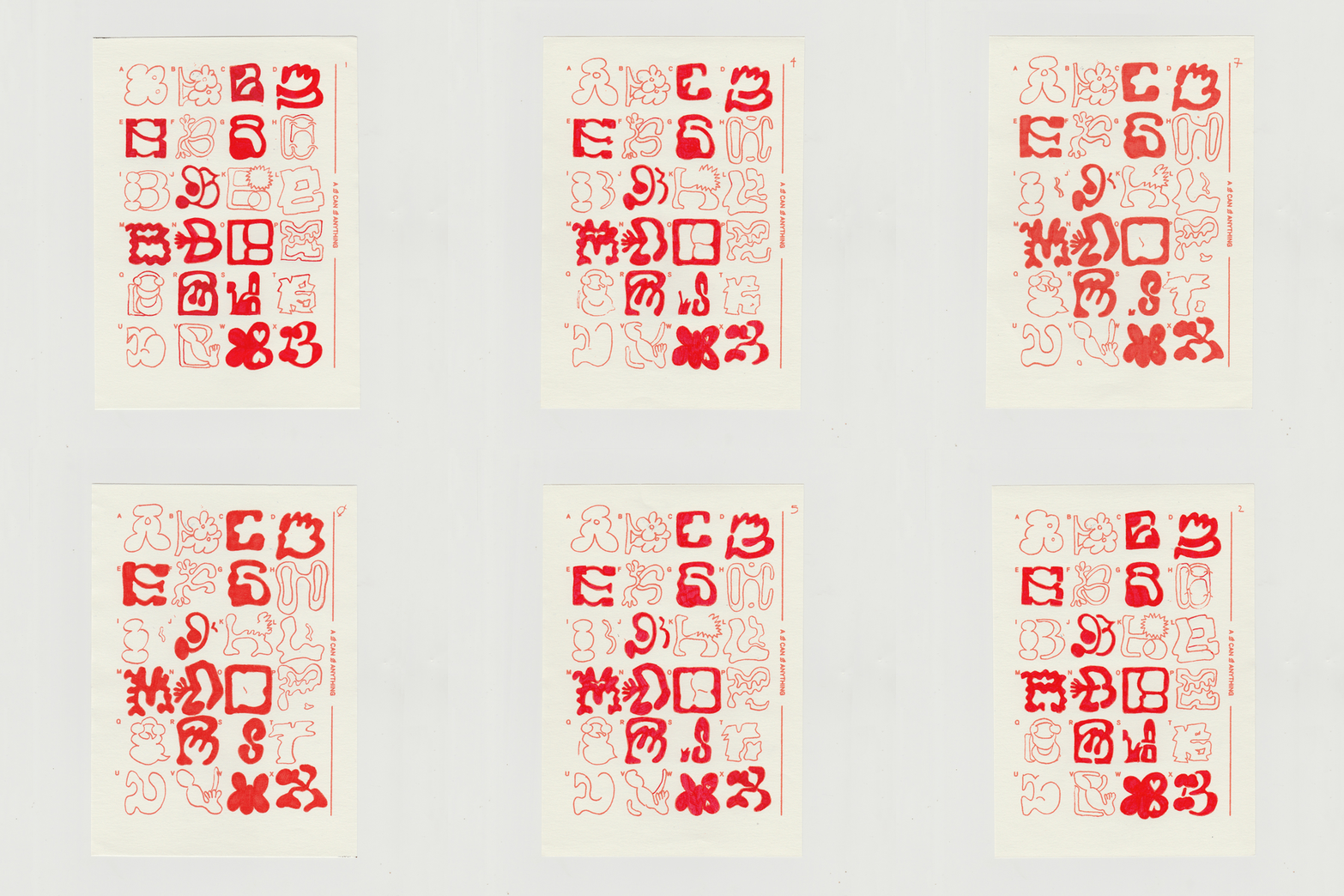
I was drawn to Anna Mill’s typography style because of its human-like aspect.
For a conference for It's Nice That, she explained her process and how it came to be, and it was funny to hear that the first time she decided to animate type, it was because the & looked like a fighter, so she gave him boxing movements. I thought it was a genius idea and a bit annoyed that she had thought of it first. She was kind enough to share her animation process, which inspired me to do the same. She explained that drawing the type gives it a more lo-fi feel but also more of a human-like quality, which I thought was interesting. For her animated type, she draws small frames and draws movements within the type. I enjoy how her typography moves, which inspired me to use typography with the same human qualities and movements that could come from dancing or boxing. By looking at the videos I took during the boxing and dancing sessions, I would like to recreate the same movement using Anna Mill’s approach.
She also explained in the video that she had to do animated type and branding for Terracotta Prints. The process was interesting to hear about as she explained that they wanted “slippery, fluid, organic, textured, type,” (2023) which made me think of looking at keywords that relate to boxing and dancing and how I could translate them into typography. Her work inspires me to give more human-like qualities to my typography and to animate it. When I saw her red and white gif, I immediately knew that it could be interesting to animate the interview answers, similarly, bringing forward the fluidity of boxing and dancing.
Pavel Alekseev
Sketchbooks
2021

Sketchbook 2021


Sketchbook 2021
Sketchbook 2021
Pavel Alekseev's sketchbooks were a significant source of inspiration for my own typography experimentation. Looking at his own designed letters helped me understand how to create more abstract content rather than recreating the conventional form. I had a blockage when I started creating letters for the dancing typography, as I would stay inside the lines of what a letter should look like. His playing with textures, shapes and patterns within the letterforms inspired me to do the same. It can be hard to push the limit with the letterforms as they seem so structured, and he showed me ways to break free from the traditional constraints of letterforms.
Bruno Munari

Alla Faccia, Munari, 1992
For the design of my typefaces, I was inspired by Bruno Munari's futuristic approach to repeatedly redrawing a human face. I really enjoy the way he plays with light and negative space which adds a form of movement to his work. His work shows the potential of pushing a theme to its limit, so I decided to redraw as many typefaces as possible to see how far I could take it. But why are his objects so beautiful and aesthetically pleasing? According to Munari, it is something called formal coherence (Antonello, 2019, p.331), where each part of an object connects with the whole seamlessly. Objects can perform their function in total harmony. Indeed, for Munari, "Visual forms should be judged for their formal coherence and for their effectiveness at communicating specific eidetic information, irrespective of any intended audience." (Antonello, 2019, p.331) This was essential to understanding how I might go about designing the typefaces and ensuring that every aspect of design held a specific function to have a formal coherence about it. Working in a similar way to Munari showed me the true potential of seeing a form of typeface in a new light.
Indian Typefaces

For the design of my dancing typefaces, I was particularly drawn to Indian typefaces. I want them to have a small quantity of Jas’s culture infused into them, but also because these fonts are beautiful and seem to have a personality. The typeface on these Indian matchboxes seems to have been written, but they have probably been screen-printed. The typography here is reminiscent of specific motifs that can be seen in Indian temples, which brings forward its cultural heritage. I find it remarkable because it is the most distinct font out there that proudly infuses its own culture. I also enjoy the blend of handwritten and more modern fonts. I find that they have a more humane aspect to them, maybe because they seem to be handwritten, which is what I want to bring forward in my typefaces to bring forward the communities within the dancing club.
Tara Books Library, No date
Onomatopoeia


As part of my research, I was intrigued by how I might represent certain sounds found in the boxing and dancing gym in an expressive and kinetic way without making them move for my screen-printed designs. I started thinking about how a silent comic book might display sound if no narration comes out of it. It is interesting how louder the sound should be and how the typography will be larger and fatter. The textures, sound, loudness, and tonality are shown through the lines and placement of the text. For example, zoom is a zig-zag in a way that is a literal metaphor for the sound it should omit. The “Ponk” similarly pushes the comic strip bubble to a punch. These two comic strip images could seem cliché, but what I enjoy about them is how retro their appeal is. I found it an exciting approach to think about whilst creating my typefaces for the boxing and dancing typefaces.
Weirdland TV on Pinterest
Weirdland TV on Pinterest
Julia Schimautz


Schimautz, No date
Schimautz, No date
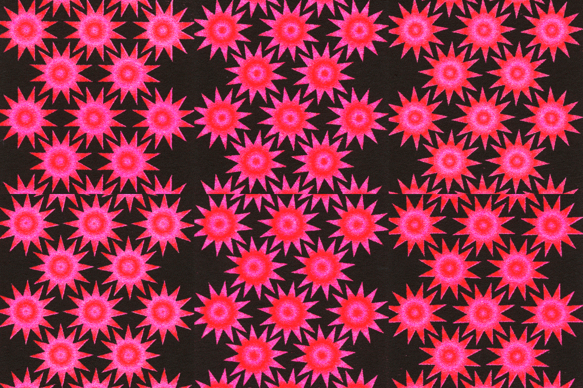
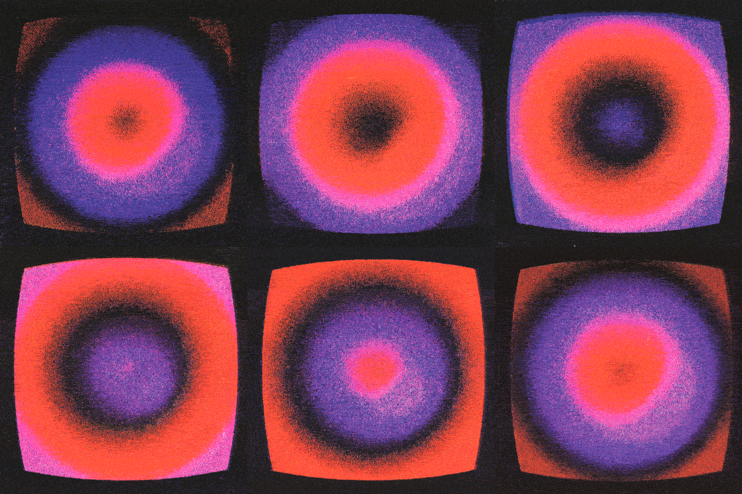
For the designs of my animation, I am very inspired by how Julia Schimautz plays with textures within her animations. Her works are created using the Risograph printer, which gives her work a sense of nostalgia. It is interesting to play with a printing technique for animation as it allows for imperfections, which is highly humane. This is something that I would like to investigate once I have finished all my frames for my animated posters. Using the printed format or bringing textures could bring forward the multi-sensorial experience found within boxing and dancing.
Cymatics

For this project, I wanted to experiment with bringing sound forward in a visual way, and I found it interesting to look at sound waves generated by heart cell sounds by Utkan Demirci and Sean Wu. There is something truly captivating about them, and they even have a natural kaleidoscopic feel to them, just like the patterns found on the leaves of plants. The heart cells can generate any patterns from triangles or hexagonal shapes. (Armitage, 2022)
I wanted to bring the rhythmic and dynamic nature of the heart palpitations drawn sound onto my screen-printed designs as they are reminiscent of the heart rate going up during a dancing class.
Wu, Demirci 2017


Gledhill, 2019
Gledhill, 2019
I was also captivated by Linden Gledhill (Gledhill, Laurinavicius, 2019), who suggests that his “photographic and creative hobbies are driven by a passion for exploring the hidden world that surrounds us.” Indeed, he photographs waves that have been created by sounds using LED lights, which are known as Faraday Waves. These are “nonlinear standing waves that appear on liquids enclosed by a vibrating receptacle” (Gledhill, Laurinavicius, 2019). This inspires me to experiment with how specific sounds emitted in the boxing and dancing gym might look abstract.
Identity
Catherine Balet (2006)

In her book Identity (2006), Catherine Balet explores the quest of young people in finding their own identity in a globalized and commercialized world. (Balet, p.1) Through her project, Balet collected pictures of young teens wearing signs, labels, codes, and aesthetic significance throughout their clothing. Posing in front of her camera, Balet portrayed goths, satanists, Gothic Lolita’s declaring “I generate my own style”. (Balet, 2006, p.7) In her work, she observes the ways in which British teens want to break free from the “anachronistic uniforms of the prestigious English schools”. (Balet, 2006, P.5) which made me think, how do the individuals in Boxing and dance clubs express their own individuality if they need to navigate with the dress codes within these establishments?
This work brings forward the question of global culture and how it might relate to the exploration of cultural adaptation and preservation of roots amongst multi-ethnic individuals in boxing and dance clubs.
The teenagers she photographed often wear tee-shirts with slogans and messages which relate to sport tournaments and advertisements highlighting the importance of visual communication of graphic design in representing one’s identity. Indeed, through these clothing’s, the teens can signal their country of origin or cultural affiliations by wearing “Italian” Nike shirts, or “Jamaica” logo sweatshirts for example.
This brought forward the fact that I should consider the importance of considering clothing and visual cues as part of the broader investigation into how individuals navigate identity and belonging and the role of graphic design within these spaces.
Balet, 2006
Skateboard Exhibition
Design Museum London
Various Artists


As part of my research, I wanted to visit an exhibition which was related to a form of sport. Although the “Skateboard Exhibition” at the design museum was not directly linked to dancing or boxing I still found It interesting to visit as I wanted to see if it might show interesting ways to play with typography when it is related to a sport. Skateboard also has a rebellious aspect to it which relates to boxing in way in which it has not always been accepted by society as it could cause potential harm.
During the exhibition I was drawn to the skateboards from the 90s but also from the 2000s as they featured bold and vibrant designs. I enjoy how they reflect on this sense of rebellion through the typography used as a décor on the back of the skateboards. Viewing these skateboards helped me a gain a better understanding on how I could portray boxing through typography to convey this sense of rebellion. The typography used for skateboard “Jess Martinez” seems to be warped and is surrounded by flames which brings forward a sense a movement and dynamism of the sport. This made me realize that I could create a series of wordings which relate to the sport of boxing and dancing which I could then recreate typographically to convey these meanings.
This exhibition was insightful as it showed how a sport can foster a sense of community and individuality using the skateboard design themselves. Make I could investigate ways to be playful with boxing gloves or dancing shoes.