Process
Initial design idea
Boxing and dancing tickets
Various dates


Beatles tickets, Pinterest
No date
Huggins and Scott Auctions,
2023

Letterology.com

Leslie Parrish
Continuing with the design idea that I had in mind during the developing practice in the graphic arts module, I wanted to design two posters which would be projected onto a wall, which would resemble boxing and dancing tickets with the animated letters dancing and boxing onto their posters.
I started looking at different vintage boxing ticket designs which genuinely encapsulate the history of boxing. The colours are usually pink, beige, and orange, with the names of the boxers fighting each other written in big and delicate type, traditionally presented by a stadium with gate numbers and the date. Their layout is horizontal. The boxing tickets have a royal appeal, as shown in their background, with intricate designs and baroque-style patterns that are shown lightly. The names of the venues on specific tickets are also surrounded by decorative elements, such as "Yankee Stadium", which brings this idea forward. It gives a sense of prestige, and provides a feeling of power to the people attending these events as the event would not have happen without them. The tickets have straight lines, which create sections within the designs, but also more decorative lines and borders, which bring a decorative aspect to the design. The layout is clean and organized because of the lines and border, which I wanted to keep in mind while creating my design.
I also looked at vintage dancing tickets for inspiration, which I found more complicated to find. I also looked at vintage concert tickets, as they bring forward the same sense of community and celebration as going to a dancing event. The Beatles tickets are also horizontal here, with bold colours such as pink and green to bring forward the excitement of the event. They also have a clean feel to them through the layout of the design.
Looking at the designs of the boxing and dancing tickets, I wanted to convey the historical and "royal essence" of these events through a similar layout and use of ornaments.
Designing layouts
Boxing and dancing tickets


Boxing Text that could be used in posters
Boxing Layout ideas
More boxing layout ideas


Dancing Text that could be used in posters
Dancing Layout ideas
Drawing inspiration for the boxing and dancing event tickets, I created layouts for how the posters might look. I started designing the boxing layout horizontally with simple rectangular shapes, with larger and smaller portions. I wanted them to have a more baroque feel with decorative borders, bringing forward the nostalgic aspect of the tickets. I also looked at the interviews I had done during the previous module and which quotes I could use to add depth to my posters. My favourite quote is, “It allowed me to see what people are willing to struggle for”, as it defines the true seriousness and discipline felt during the Boxing classes at the Bristol Boxing Gym whilst also bringing forward how it brings forward communities.
I then started to create the layout for the dancing posters; I found it challenging as I wanted it to look like a dance event ticket, retaining the sense of organization from the Beatles concert tickets whilst also giving them more of a sense of freedom as felt during Jas’s dance classes. I also looked at the previous quotes from the interviews with the members of her class. My favourite quote is, “Encourages me to be there for a sister”, as it brings forward the true sense of community in her class and the familial aspect which can be felt with certain club members.
Prototypes
Boxing and dancing posters prototypes

Bristol Boxing Gym
Prototype 1

St Wergburghs "Find Your Fierce"
Prototype 1
I created two designs for the St Werburgh “Find Your Fierce” dance club and the Bristol Boxing Gym club. I felt really stuck at this point, perhaps because I could not see how the designs would look animated. I decided to play with the hierarchy of the text sizes to emphasize the key quotes in the boxing poster, such as “It allowed me to see what people are willing to struggle for” and “You VS You”. I also decided to use some of the text found in the vintage posters, such as “section 89” or “lower box seat”, to give the audience a sense of what they are looking at. However, is it necessary, and does it make sense?
The dancing poster posed even more challenges, as the initial layout I created seemed to suppress my visual imagination. To overcome this, I experimented with a more free-flowing layout, reminiscent of dance movements, to bring more life into the design.
The design was also very minimalistic and did not express my maximalist style. Using a bold sans serif font made it more challenging to see what the poster would look like, as I was not using the ones I had made.
Paul Barnes
Visiting Speaker

Frame Serif
Andy Edwards
No date
Learning about visiting speaker Paul Barnes's thoughts and processes behind creating his typefaces and editorial designs was interesting. He told us about his work for the Guardian, where he created the Guardian brand identity, which is unique and recognizable. Even so, the brand never bought the rights to the typeface as it is so connected to its identity that it makes it unappealing to other businesses.
He also showed us his unique influences from Phillipe Stark Chairs, renaissance drawings and military boats, which bring a blend of modern and ancient to his designs, showing that inspiration can come from anywhere and not just by looking at other typefaces. I also really enjoyed his innovative approach to creating a sort of "Guerrilla marketing" for his typeface, where he printed his typefaces on enlarged posters, which he then asked his team to bring to bike races so the media would photograph them.
I then showed him my central project idea for "How can boxing and dancing become type?" with the animated typefaces I made during the previous module and the recent layout experiments I had made. He told me that I should probably start creating the animated typefaces first to see how many letters I could create for the posters in the amount of time I had. It would also let me see if they work as a whole sentence rather than letter by letter.
Type animation
Inspiration
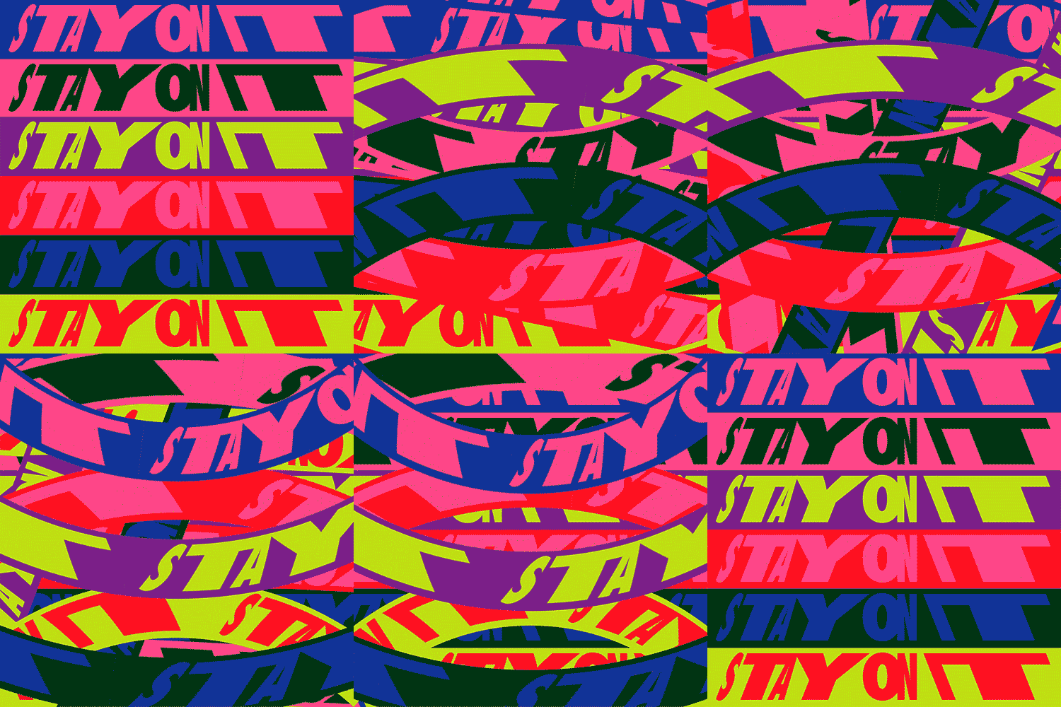
Kris Andrew Smalls
"Stay On It" 2023
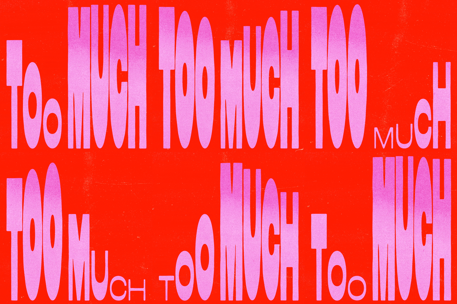
Type Scraps
Too much - No date

音乐演出海报
Boiled Cabbage 2020
I examined how graphic designers play with type to convey a message through animated posters. I particularly enjoy Kris Andrew Small's "Stay on It" animated poster design. The artist plays with words by making them glide across the screen in a rotating loop, creating an intense and overwhelming feeling. This playful approach ensures the message is constantly present, never leaving the screen.
I also appreciate Type Scraps' work on "Too Much," which metaphorically amplifies the idea of excess by having the words "too much" grow and shrink, filling the screen in a loop. Similarly, the "Boiled Cabbage" poster from 2020 uses background text that expands and contracts. I enjoyed these looping techniques and manipulating shapes and sizes to convey movement and add depth to the words.
These techniques inspired me to apply similar concepts to my posters. I decided to change the fonts within my designs, change sizes, and move them in loops to convey meaning and bring a dynamic feeling to the messages.
Type Design
Boxing poster

Boxing Civic Center
Fox vs Pearce
1940

The Sound and the Fury
Foster vs Ali
1972


Typography for boxing poster
I then started to think about the types that will be used for my poster designs. For my boxing poster, I found inspiration in vintage boxing posters, which use different types of fonts with different sizes and weights, such as the poster for "The Sound and the Fury", which is for a fight between Bob Foster and Muhamad Ali. Some fonts have different shapes and sizes, bringing forward the fighters' names in Ultrabold to emphasize their importance, or "The Sound of the Fury" appears blurry and smudged to make it seem bloody or even more human-like. The boxing poster for Fox vs Pearce from 1940 also uses different fonts and even has a Western font, which reminds me of the movies when two cowboys are in a duel with their guns facing each other. Using different types of fonts gives the posters more intensity and passion, which is what I wanted to bring forward in my boxing poster.
Boxing type animation
Tests
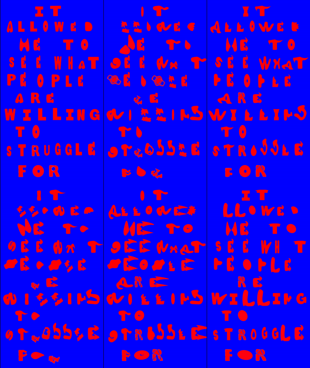
Animated type test

Boxing moves (Pinterest)


Glove signed by
former world champion
Alan Minter found in a London antique shop
Boxing Belts
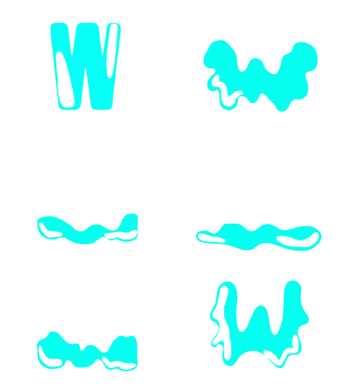
I created the animated types based on animatics that I had created during the previous module and by looking at the videos I had taken to mimic the movements. I wanted to be sort of like metaphors for boxing:
- “I” shrinks and becomes stronger
- “T” is doing the Jab
- “A” is doing the left hook
-“L” is breaking and rebuilding itself, a bit like a metaphor for the struggles of boxing
-“O” becomes a speedball
-“W” is doing the Jab
-“E” is a metaphor for the arms stretching out
-“D” breaks and rebuilds itself
-“S” becomes a glove
-“h” becomes stronger and stronger
“P” becomes a boxing championship belt
-“G” becomes a jab
-“U” becomes various elements in a boxing gym, such as glove, speed ball, and mask.
-“R” breaks and rebuilds itself.
By creating this animation, I wanted to bring forward the strength, dynamism and resilience that comes with boxing. I wanted to represent the principal boxing moves whilst bringing forward the objects associated with them. I then placed the letters together to see if they could fit and found that it was overly intense and even “psychedelic”, which was not what I was going for. So, I decided it would be better to do one letter animated and another not animated so it would not overwhelm the viewer. I felt that it also gave the animation a rushed feel to it. I made it so that the letters became their own identities in a way, so the letters did not connect to each other but become a word as whole. Each letter would move in its own direction or become static, much like each member of the dancing and boxing clubs. In a way, I wanted to bring forward the individuality of each member and the unique movements they might choose to do in the gyms.
Tutorial
Orla
During a tutorial with Orla, I showed her my concepts in which I plan to utilize typography to mimic or transform boxing and dancing movements to create visual metaphors. She told me that I needed to think about the broader audience for my project: who do I want it to resonate with? I knew it would be for the people who would be attending these clubs or who might be too shy to attend a club on their own. She told me that I should test different styles and mock-ups to find the most effective approach for my project. I also told her about how boxing tickets had inspired me, and she told me that I should find ways to give it a retro feel but one that could be suitable for more modern audiences. I also needed to make sure that the typographic animations were engaging and memorable but also highlighted the strengths and dynamism of the Bristol Boxing Gym.
Tappenden
Visiting guest speaker

Dyson, V8 advertisement, 2017
The talk by Ben Tappenden was incredibly inspiring, especially when he mentioned that he had worked on the colouring of the instruments for Dyson and had no experience with it. Because I find that a lot of the job opportunities out there always mention needing “2 years of experience”, which is discouraging, but it shows that lack of experience should not be a cause for barriers. I asked how he learned how to do it, and he explained that it is essential to understand production instead to achieve better design outcomes, so he went to every department and learned from them. He also told us about the importance of keeping in contact with the people on my course who can influence my career and the importance of reading manuals rather than having someone explain something, which is very accurate.

Philippe Apeloig, Hermes, 2013

Following his talk, I had the opportunity to discuss my project with Ben Tappenden and show him my work in progress. His feedback was useful, particularly his observation that the types I had created were playful and demonstrated the versatility of types as more than just static images. He also introduced me to the works of Philippe Apeloig, who uses type in an emotional way, giving them a life of their own.
I started to look at his work, which I found truly inspiring, especially his work for Hermes, where the type becomes a horse, the emblematic symbol of the brand. The type is fine, bringing forward the elegance of the brand, but it also has a more humane and emotional feel because of how it moves simultaneously with the music, which is quite playful. It is exciting how the type becomes a carrousel. This made me realize that I also need to bring a more emotional aspect to my work in order to connect to the audience.
Illustration
Muhammad Ali
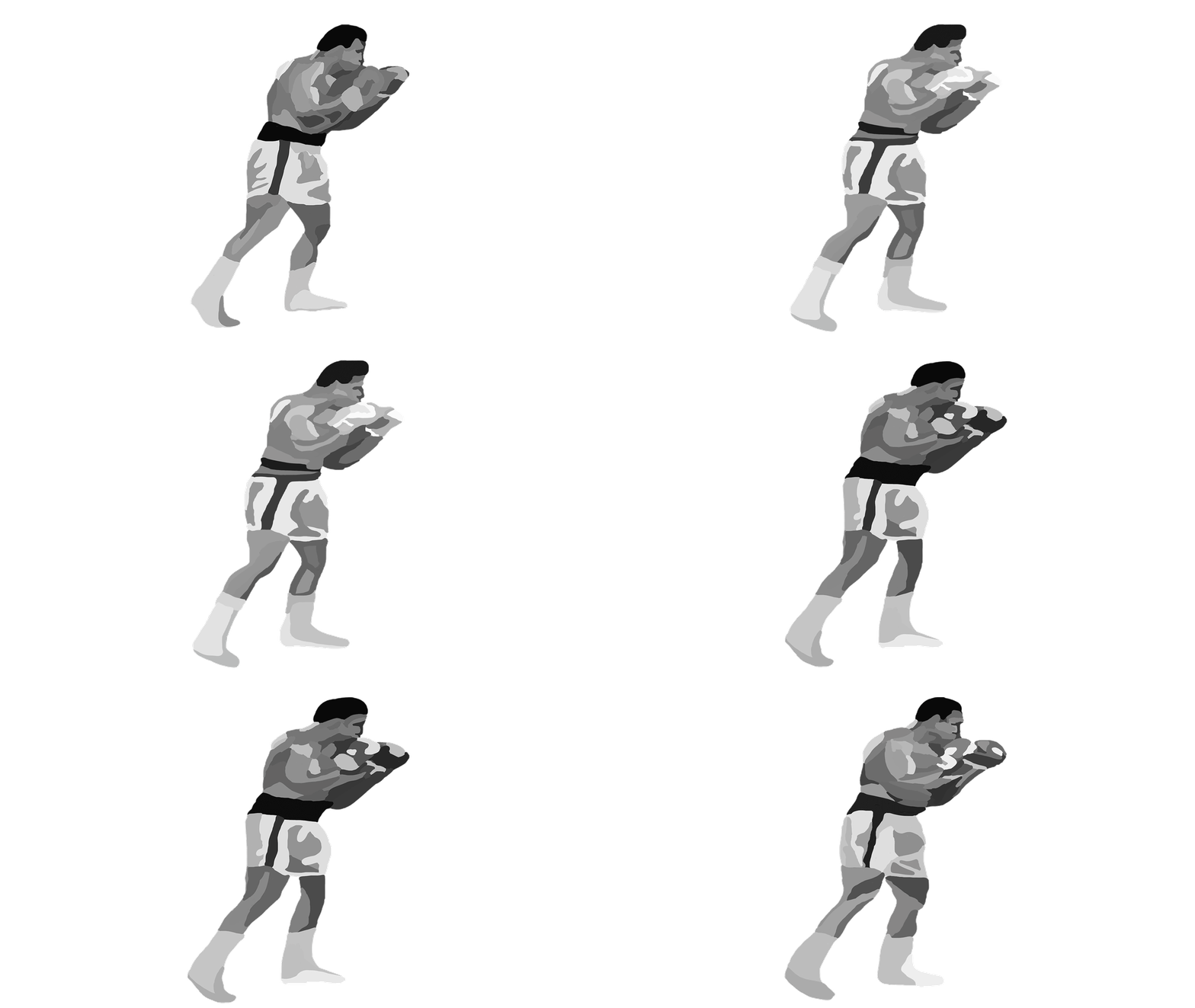
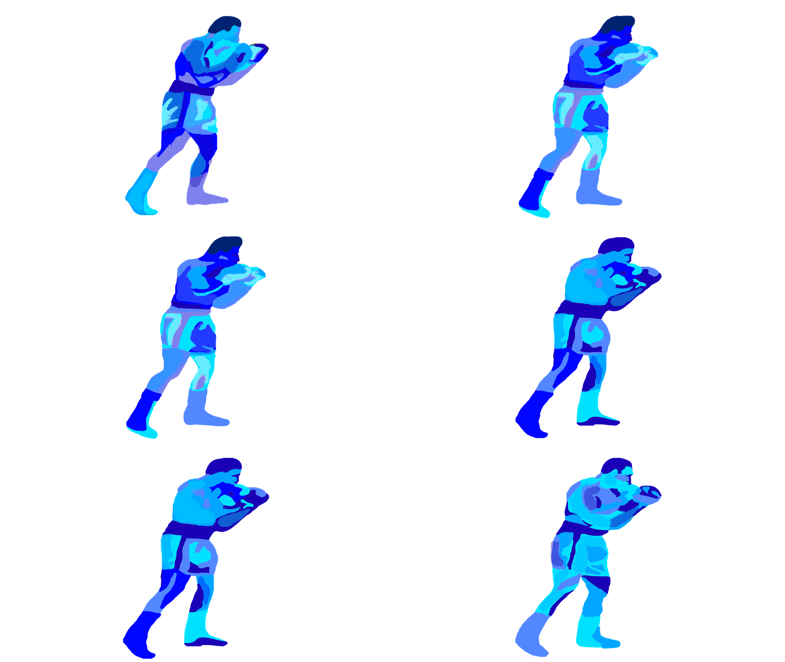
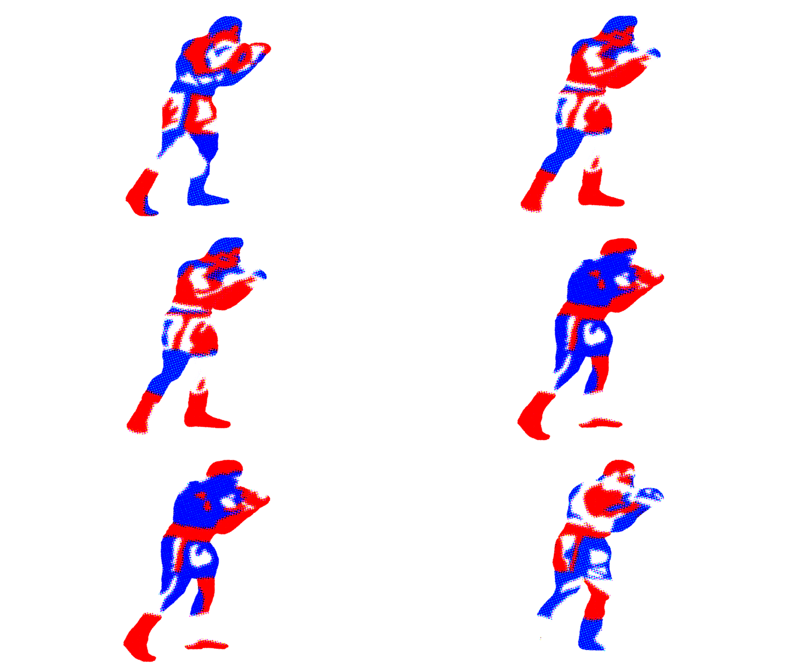
Muhammad Gif Tests


Gordon Parks, Untitled, 1970
Brooklyn Museum, New York
Gordon Parks, Untitled, 1970
Brooklyn Museum, New York
I decided to place a central image of a boxer in my poster, similar to traditional boxing posters. I thought about who I might choose to embody heritage and strength but also someone instantly recognizable, even to those unfamiliar with boxing. I chose to depict a male boxer because all my trainers at the gym have been men, a nod to my admiration for my trainer, Darren Hamilton.
I saw the Giants Collection by Swiss Beatz and Alicia Keys during a visit to the Brooklyn Museum in New York. Throughout this module, I visited several museums for inspiration but rarely saw boxing-related art. Then, while I was there, I came across iconic photographs by Gordon Parks showing Muhammad Ali in a different light. These photos captured Ali's softer side, showing him teaching a kid how to box or sitting on the ring with a playful expression, contrasting the typical aggressive images of him in the ring.
Seeing these photos made me realize how much of an icon Ali is. Despite visiting more than six museums in London and New York, he was the first boxer I saw depicted as an art piece. His achievements are legendary, but I'm also inspired by who he is. I remember his quote: "I do not count my sit-ups; I only start counting when it starts hurting because they are the only ones that count." (Medium, 2018) And, of course, his famous "Float like a butterfly – sting like a bee." (The Guardian, 2016) There is something philosophical about him, so I chose to depict him in my poster. It might be cliché or tacky, but that is part of what I enjoy in design.
I started watching Ali's videos on YouTube and decided to record a moment I thought would be interesting to redraw and recreate as a GIF in Photoshop. I chose not to depict him boxing directly, as I wanted the typography to convey the action. Initially, I made him greyish like traditional boxing posters but then experimented with different textures to give him a more vintage, print-like appearance. By doing so, I wanted to pay homage to a legend.
Background designs
Layout Inspiration

ADVHH 2021 Year BianBian (Artist Unknown).

Ali vs. Chuvalo. 1972. Boxing Poster. (Artist Unknown).

Ali vs. Chuvalo. 1972. Boxing Poster. (Artist Unknown).
I found inspiration from the layouts of boxing posters, Topps Red Backs vintage baseball cards, vintage boxing event tickets, and a more contemporary image, "ADVHH 2021 Year Bian Bian", which has been created for the 5th International Digital Biennial at the Arsenal Contemporary Art Montreal. The structure and layout of the typography in my designs are inspired by the bordered sections and distinct areas found in all four designs. I wanted to bring forward this design hierarchy, which is mainly found in sporting event posters or tickets, to contextualize my designs.
I felt inspired by the boxing posters their use of layout, which directs the viewer's gaze and reinforces the importance of attending the boxing match. I was especially inspired by the layout for the "International Boxing Pacific Coliseum: Muhamad Ali vs George Chevalo" from 1972. The layout highlights essential details, which entice the viewers to the focal points of the designs. The images are usually black and white in boxing posters, giving it a more serious tone that brings forward the match's seriousness, which inspired me to do the same for both of my posters. I noticed that many vintage tickets have a historical and royal feel, using decorative lines and baroque-style patterns to convey importance, which I also wanted to bring forward in my posters by creating my own.
I enjoyed the playfulness of the baseball designs, which use playful shapes to bring forward certain elements. I wanted to bring a contemporary tone to my design, inspired by the "ADVHH 2021 Year BianBian" poster by an unknown artist on Pinterest. The design here is reminiscent of early video game graphics but has a more contemporary tone. The use of decorative borders and vibrant colours in that design inspired me to bring forward the dynamism of the clubs in my designs.
Background designs
Background tests


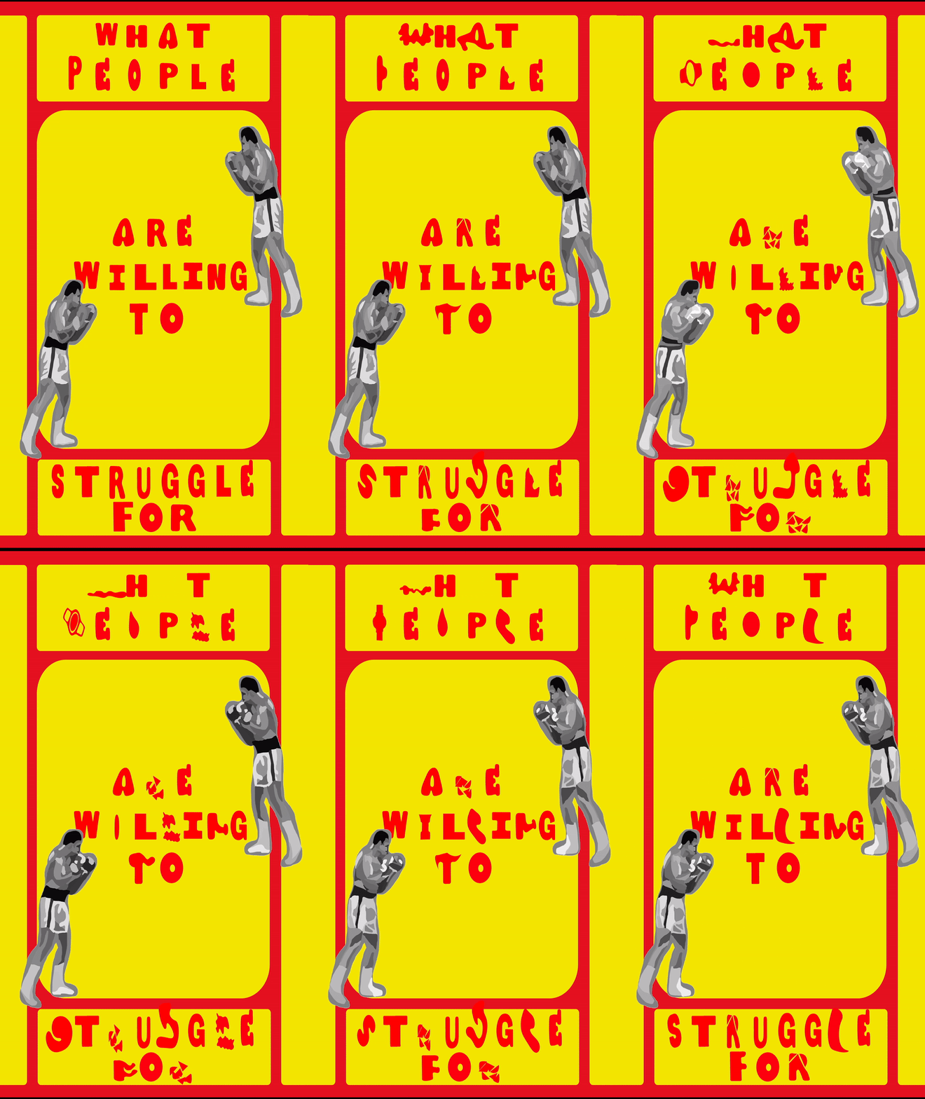
Poster tests
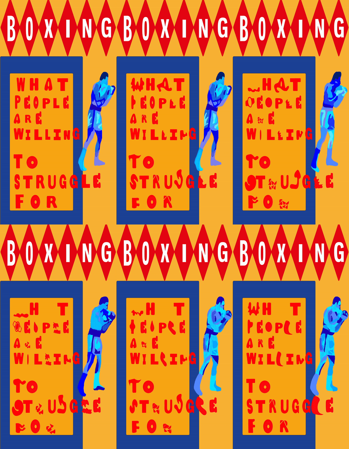
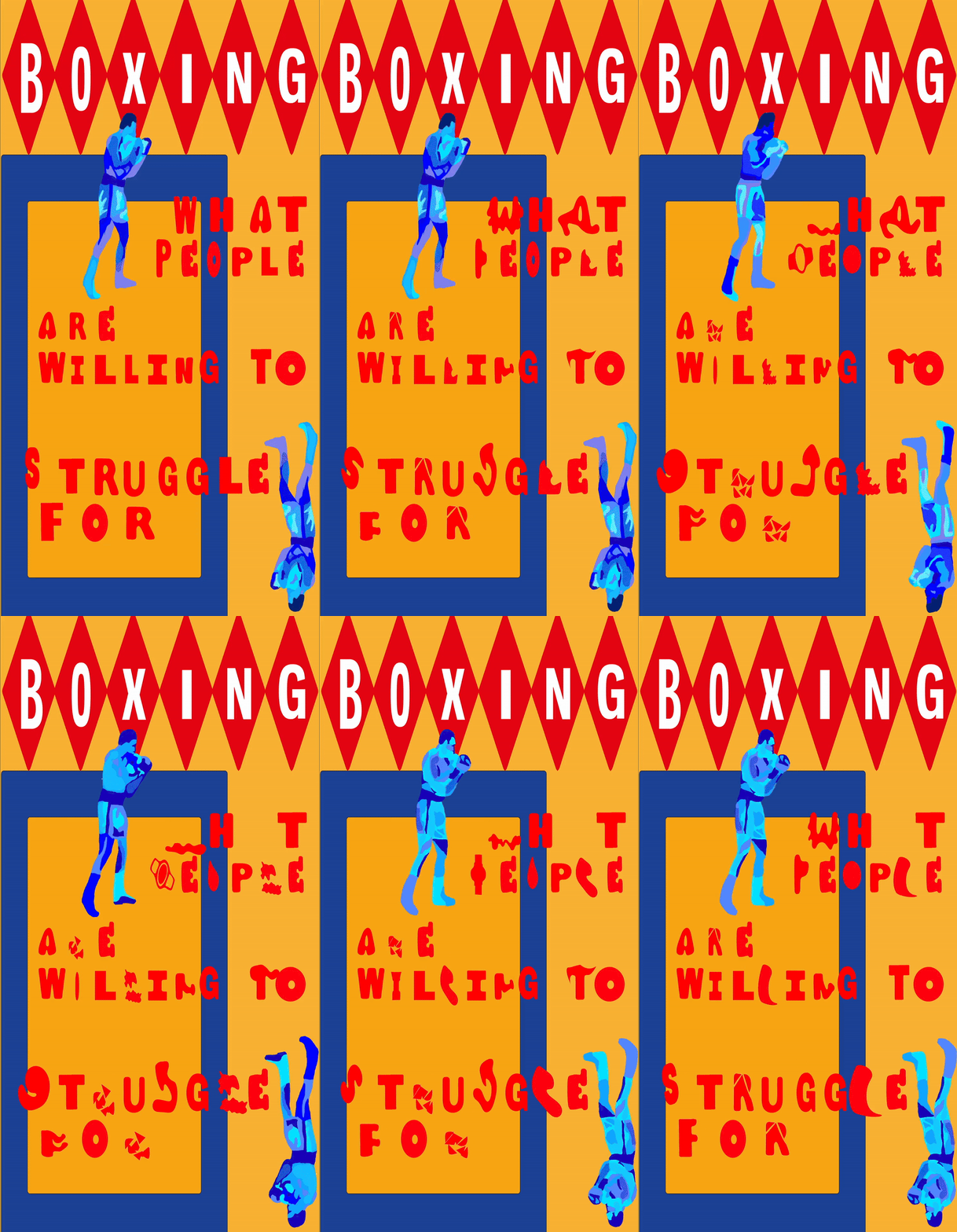
I started designing the backgrounds for my animated type by experimenting with different shapes inspired by baseball cards and boxing posters. It was pretty challenging to figure out the layout because I had to use static type instead of the animated GIFs I had created. The problem was that once I designed the background and played with the layout in After Effects, the animated type did not fit into the frames since they all had different shapes and sizes.
I hit a creative block and disliked the designs I was creating. I was trying to blend the layout of traditional boxing posters with ornamental designs I had come up with, inspired by those on boxing ticket backgrounds. The typographical principles were ignored entirely, and everything was thrown onto the image. The designs looked too corporate because of the block colours and geometric shapes, and my style needed to be more explicit. I tried using the same colours as boxing tickets, but it didn’t work.
The designs lacked the energy and dynamism of boxing that I wanted to bring forward with the animated type. The ornamental designs and block colours did not mix well, there was no cohesion, and the posters did not respond to my vision. I wanted to find a way to incorporate my style while maintaining the vintage boxing poster influence.
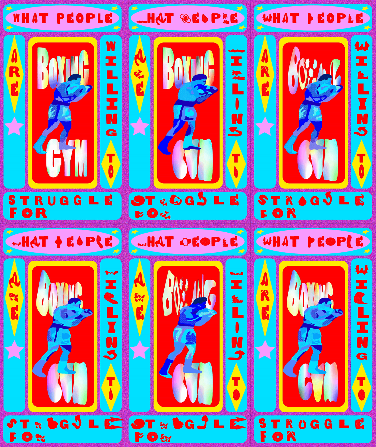
Animated poster more "contemporary" version
I began to rethink the style I wanted for my poster. I was aiming for something more contemporary. I was inspired by the old vintage video game styles and the "ADVHH 2021 Year Bian Bian" design from the 5th International Digital Biennale at the Arsenal Contemporary Art Montreal. I wanted to blend modernity with some aspects of classic boxing posters.
To create this look, I incorporated paper textures into the "Boxing Gym" font and used Photoshop to add a grainy, pixelated effect to the pink background. I then transformed the Muhammad Ali GIF into a more colourful version, making it look like he stepped out of a video game. The multicoloured palette added a contemporary vibe, while the yellow and red background kept the traditional boxing poster feel. It looked like it came out of a casino, which I liked.
By blending the old with the new, I wanted to bring forward the history of boxing and show its relevance today.
Workshop
Background tests

Workshop notes
During a workshop, we had to show our final major project exhibition work in development, and I showed the boxing animated poster above. It was useful, as I received feedback regarding my poster with questions that I should ask myself. It made me question the design choices behind my poster and whether the colours fit the boxing theme.
For example, one of the comments asked why I had chosen a rainbow colour for the title "Boxing Gym", which made me realize that it might be confusing for the theme. The feedback helped me to see my current layout and colour choices, how it should fit more to the theme and intensity of boxing and how specific texts should be more centred. The colours here give the boxing poster a more light-hearted feel, which is not bad as it could remove the cliché behind it. However, it also gave me the idea of creating a more intense and violent feel for the dancing poster. However, I realized that it was not the purpose of my project.
It was helpful to see my poster from another perspective and how I should look more into conveying the intended message why is to show the intensity of boxing through type whilst keeping in line with the theme through the design.
Theoretical literature
Type in Motion - Innovations in digital graphics
Jeff Bellantoni & Matt Woodman
2000
The book Type in Motion – Innovations in Digital Graphics was essential for my research as it showed me through various examples of artist works, how digital technologies can elevate visual communications, making the "message" more engaging and effective for audiences.
Bellantoni and Matt Woodman discuss how effective communication relies on the successful use of tools and methods for recording and sharing information. (Bellantoni, Woodman, 2000, p.006) Traditionally, these methods have remained unchanged for readers; “who expect printed texts—whether a book, magazine, or newspaper—to have a static set of words that can be read and re-read, a fixed order of pages, portability, physicality, and permanence.” (Bellantoni, Woodman, 2000, p.006) However, visual technology is transforming how letterforms are seen and used. Indeed, "Type is no longer restricted to the characteristics found in the medium of print such as typeface, point size, weight, leading, kerning." (Bellantoni, Woodman, 2000, p.009) Now, text can change and move, becoming "kinetic," with letters and words that flow or transform into three-dimensional structures. (Bellantoni, Woodman, 2000, p.009)

Ferro, P. (1960).
Ferro, Mogubgub & Schwartz.
I was inspired by Pablo Ferro's work, which uses motion design to make the message more engaging for the intended audience. Ferro pioneered the concept of the quick cut, which "produced a rapid-fire barrage of exploding type." (Bellantoni, Woodman, 2000, p.200) This concept can be seen in the promotional film for the formation of the commercial studio "Ferro, Mogubgub & Schwartz," where bold, slab serif letterforms for "Films by Ferro, Mogubgub & Schwartz" dance, twirl, flicker, and run away from the screen, reappearing in sync with the music. This playful and dynamic presentation captures the essence of the design studio. This inspired me for the animation of my types, making them move fast and being in line with the music, showcasing the dynamism of both clubs.
Ferro’s use of multiplicity, particularly in showcasing different fonts for the exact words within his designs, also influenced me. The opening sequence for the Hartford, Connecticut pay-TV station, Channel 18 from 1960 features various fonts such as modern, hand-drawn, and old-style typefaces. By doing so, Ferro demonstrates the range of programs the TV channel offers, enhancing the viewer’s understanding and engagement with the content. (Bellantoni, Woolman, 1999, p.22)

Ferro, P. (1960). The Hartford, Channel 18.

Gutler, A. (n.d.). Ecran
For the titles of my posters I decided to follow André Gürtler’s approach by considering the “proportional, rhythmical and stylistic characteristics of letterforms – visualizing a form concept and carrying the work through to a unified whole” (Bellantoni, Woodman, 2000, p.128). Looking at projects from his past students inspired me for my project through the way that they would play with letterforms by manipulating speed, time, shapeshifting, and transitions to give a metaphorical approach to the word. For example, for the project "Ecran," (projection screen in French) the letters “mimic the flow of an opening curtain.” (Bellantoni, Woodman, 2000, p.135)
Type tests
Boxing type tests
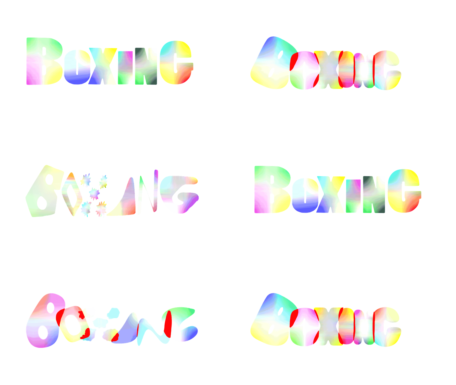
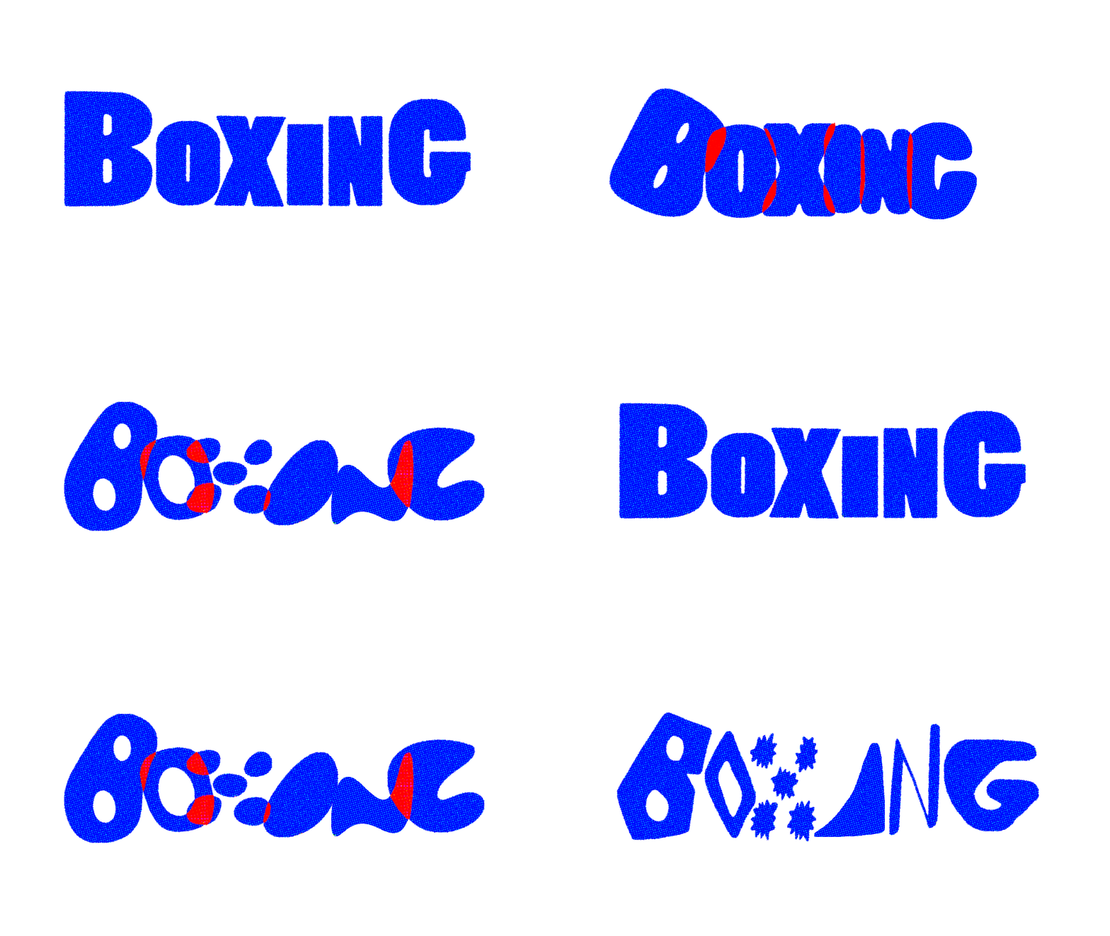
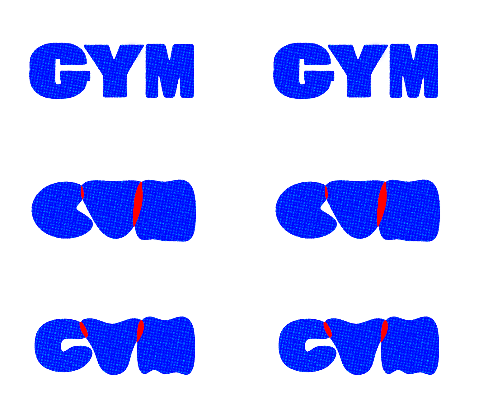
More bloody and screen printed version (Final Version)
More video game style version
More anime style version
I decided to change the aesthetic of the title "Boxing Gym" because I felt that the ironic use of multicolours did not convey the aesthetic of the boxing gym. Following André Gürtlers's approach (Bellantoni, Woodman, 2000, p.128), I blended the letters for the "Boxing Gym," making them bounce together as if they were in a fight, with some parts becoming red to add to the drama (blood injuries) but then rebuilding. I wanted to capture the intensity and physicality of boxing, bringing forward its transformative nature. I also tried playing with different textures for the other letters within the poster, but I decided to keep them in red to make them stand out more.
Textures
Decorative patterns


Historic Design in Printing, The Graphic Arts Company, Boston (No date)
Textures used in final animated posters
I wanted to bring a paper feel and textures to my boxing and dancing posters and I felt inspired by historic patterns from the 16th century because of their royal feel which I felt were reminiscent of the ones in the background of boxing tickets. I decided to create my own with a more contemporary feel on illustrator and added textures to it to use as decorative borders around my posters.
Boxing Poster
Layout test
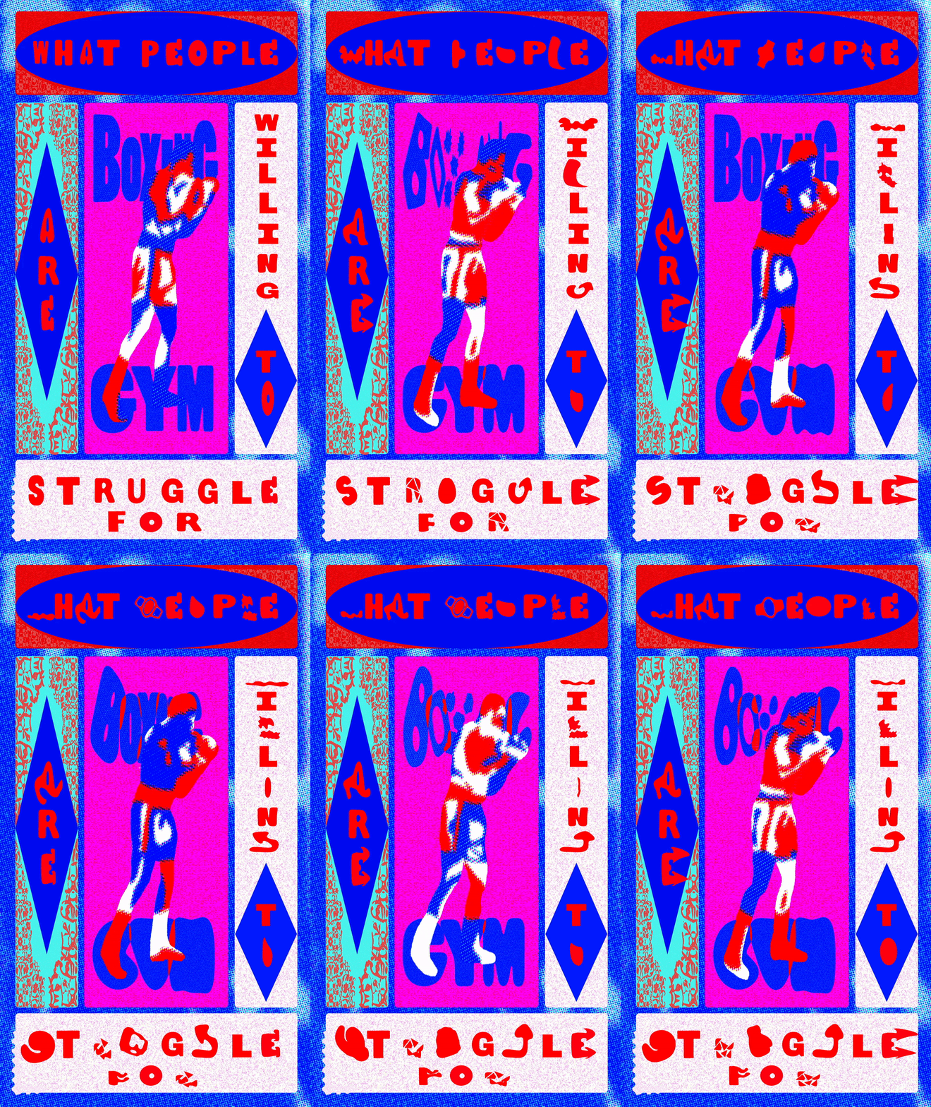
Animated Boxing poster new version
I decided to recreate my boxing animated poster and to give it a more authentic feel which is true to my own style through its use of colours.
I also wanted the colours to be more gender neutral as both men and women join the boxing club.
Dancing type
Inspiration


Amado, B. (2017). Cool Tempo.
Toliver, D. (2023). The Lovesick Tour

Scherr, P. (1995). Bring In 'Da Funk.
New York Public Theater.


Final dancing typography for animated posters
For the dancing poster, I wanted the fonts to be more fluid and playful, reflecting the lively vibe of the dance class. I combined different fonts, some with a more serious tone and others with a more human touch. I was inspired by three posters: "Don Toliver – The Lovesick Tour," "Bring in Da Noise, Bring in Da Funk" by Paula Scher, and the "Cool Tempo Palm Springs" event poster. Paula Scher's poster caught my eye with its expressive typography – how she plays with shape, size, placement, and vibrations makes the type come alive. It inspired me to use varied font sizes and placements to capture the sounds and energy of Jas's dance class. I felt inspired by the human-like qualities of the typefaces in the Cool Tempo poster as it creates a playful and inviting tone, much like Jas's dance classes. Don Toliver's poster stood out with its mix of different fonts, which inspired me to do the same to emphasize the individuality of each attendee in the dance class. These posters inspired me to create fonts that have fluidity and playfulness and can capture the fun and unique energy of the dance class. I also thought that blending different fonts within the poster could give it a more human feel because it looks more DIY in a way, bringing forward the fact that Jas encourages us to make mistakes during her class, to not take ourselves too seriously and to be playful.
Dancing type
Animation
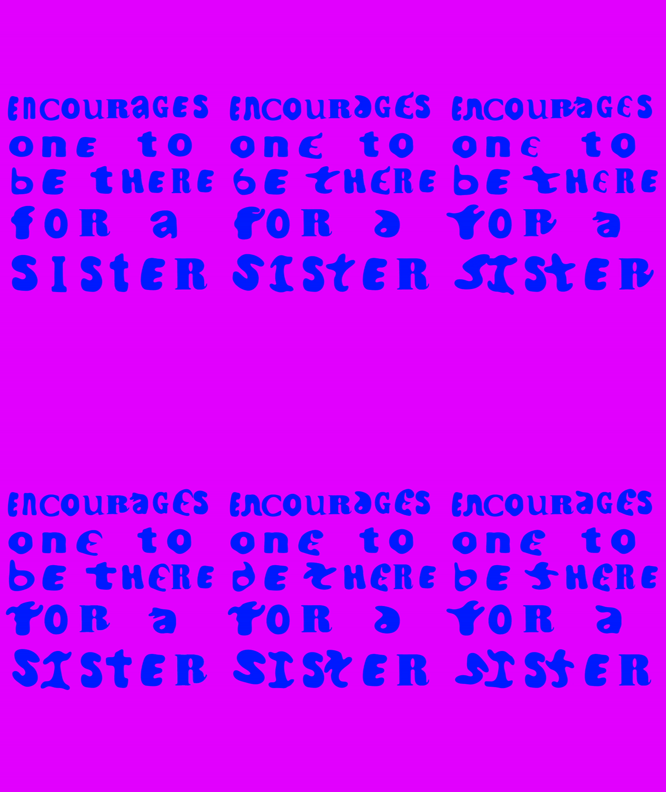
Final animated dancing type
I created the animated types based on animatics that I had created during the previous module and by looking at the videos I had taken of Jas's "Find your Fierce" dance class to mimic the movements. I wanted to be sort of like metaphors for dancing.
Just as with the boxing animated letters, I made deliberate design choices for the dancing letters. By animating one letter and leaving another static per word, I aimed to soften the intensity and capture the true essence of dancing. I wanted the type to giggle and dance playfully, a reflection of the joy and energy found in Jas's dance class.
- "N" moves its "legs", bouncing up and down.
- "O" is wiggling its body in a circle.
- "R" taps its feet rhythmically.
- "A" becomes fire, showcasing the adrenaline rush that comes from the dance class.
- "E" moves its arms and expands outwards.
- "B" sways it's arms
- "T" dances with its whole body
- "F" becomes a human who moves its arms and dances to the beat
- "S" shakes its body playfully
- "I" morphs and becomes a more extensive and more muscular shape dancing.
I wanted the movements to be more human-like and playful, reflecting the light-hearted tone of Jas's dance class.
Animation
Uma dancing

Instagram questionaire

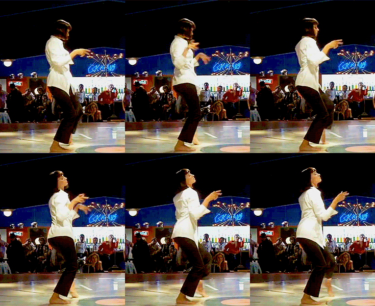
Pulp Fiction (1994) Quentin Tarantino
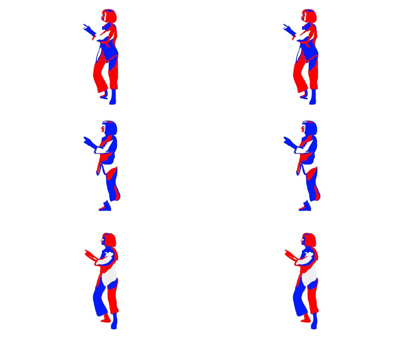
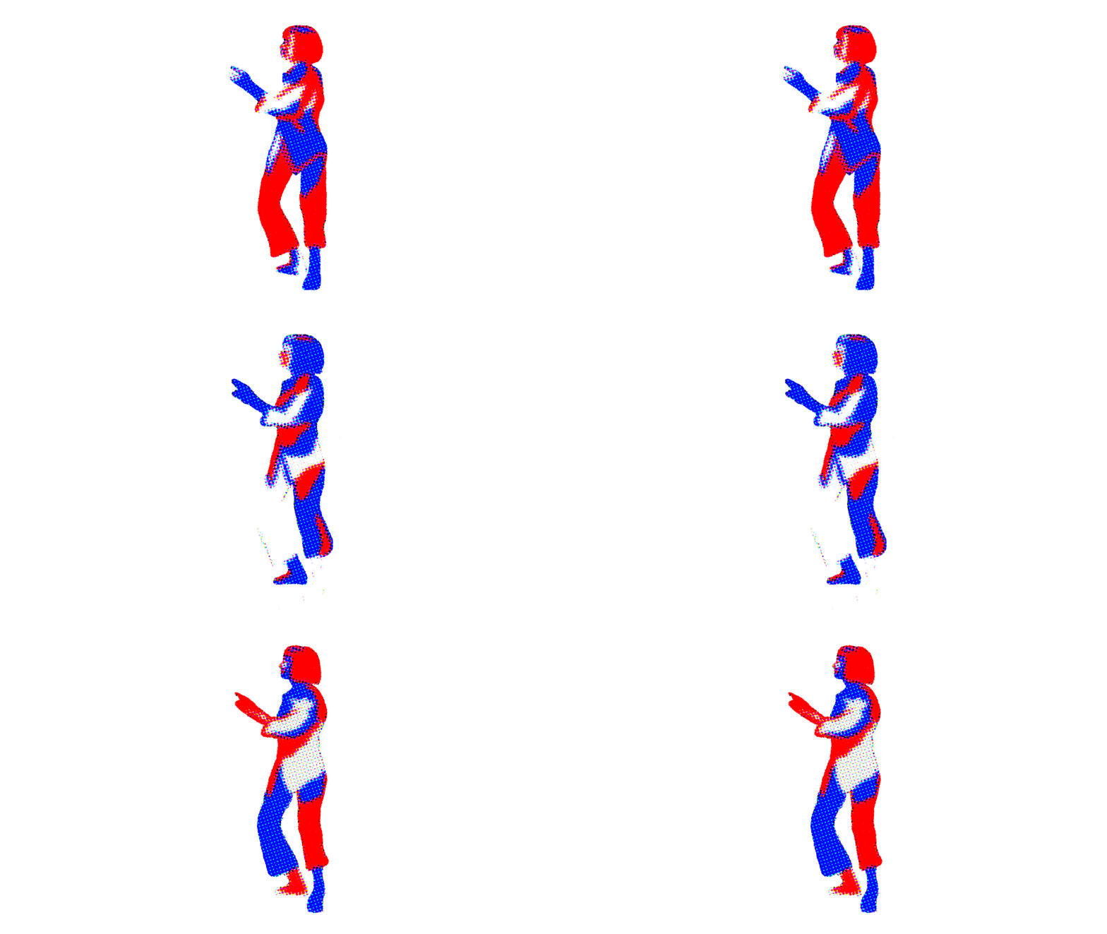
Animated gif tests
I struggled to decide who to animate as the dancer for my dancing poster. The boxing animation was easier since Muhammad Ali is seen as the king of boxing. For the dancing class, which is women-only, I wanted to feature a woman. I created a questionnaire on Instagram for suggestions, but no one responded.
I spent an afternoon watching dancing videos on YouTube and rewatched the iconic dance sequence from Pulp Fiction with Uma Thurman and John Travolta. That’s when it hit me—it could be interesting to make the posters look like a dance and boxing battle, with the dancer and boxer facing off in their respective posters.
After creating the animation, I had a dilemma. I worried that having a woman as the dancer and a man as the boxer might come off as reinforcing gender stereotypes. But then I realized it made sense for my project. The text for the dancing poster is “To be there for a sister,” and it reflects my real-life experience: my boxing instructor is a man, and my dance teacher is a woman.
Dancing poster
Background tests


Dancing poster background test
I found that creating the dancing poster was easier because I had already developed the style for the animated boxing poster, and I wanted to keep their styles cohesive. For the dancing poster, I decided to use different shapes that were a bit less structured compared to the boxing one in order to show the light-hearted and free-spirited nature of the dance class.
Tutorial
Orla

Animated poster Animated Ali
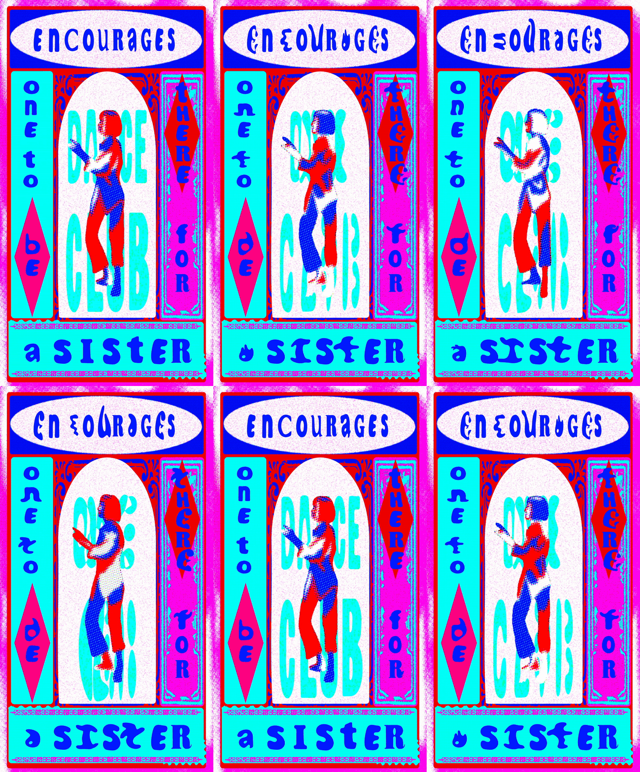
Animated poster Animated Thurman
During a tutorial, I showed Orla what my final posters might look like, and she pointed out that the female dancer seemed more static than the male boxer, which could be perceived negatively. Her feedback made me realize that using animation for the characters might detract from the animated type and could suggest a lack of confidence in my design skills. As a result, I decided to use still images for both characters to keep the focus on the animated typography. She also suggested that the project could also extend to a zine to make the research that I had done last term more accessible to audiences.
Final animated posters
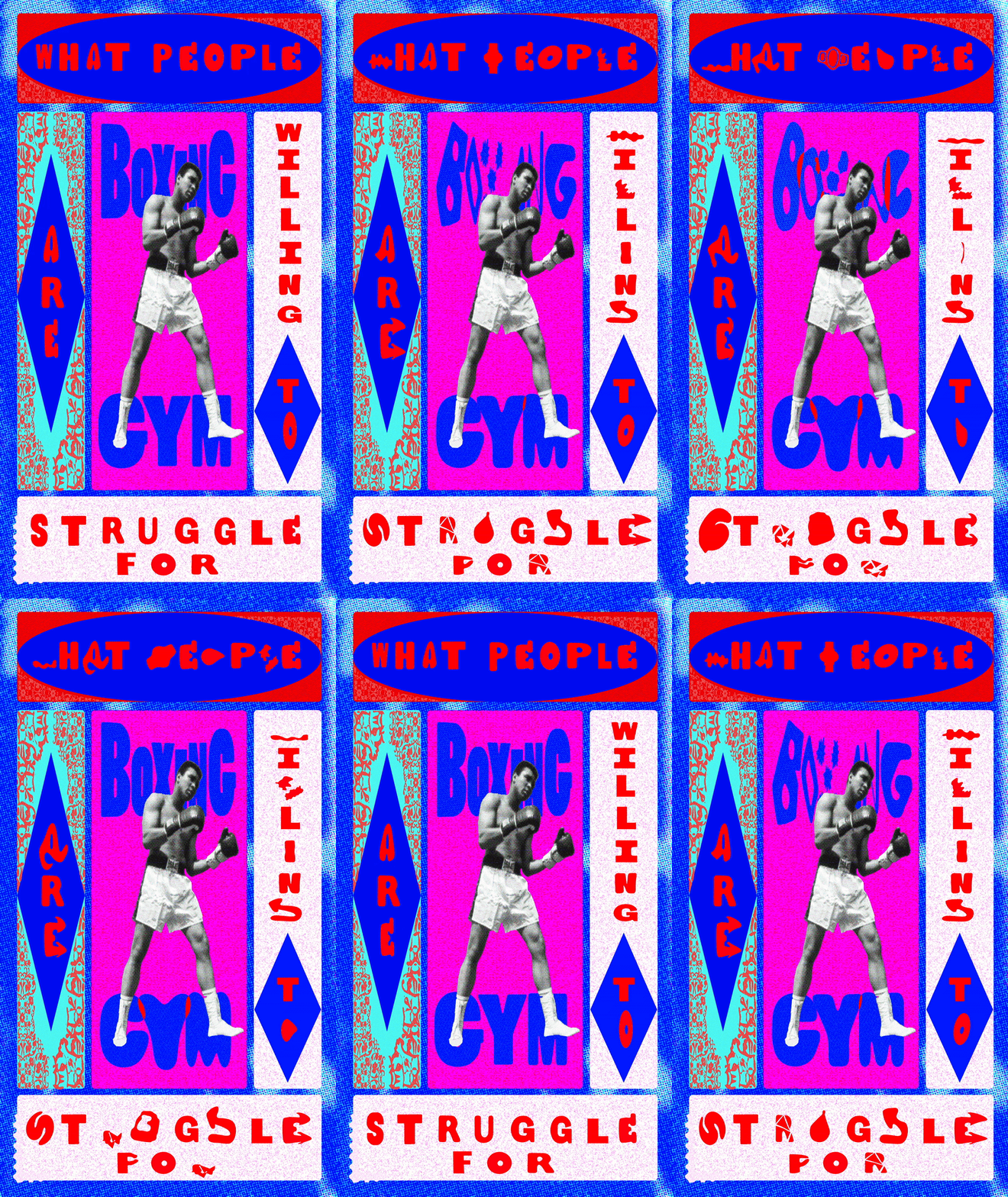
Final Animated Boxing poster
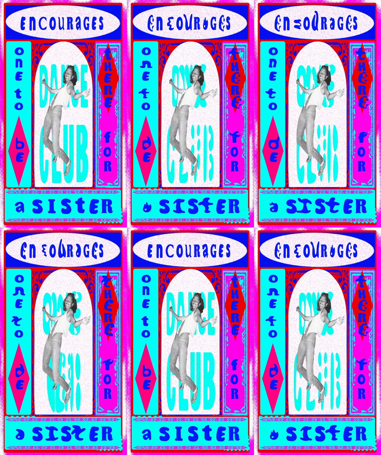
Final Animated dancing poster
I decided to use a static image instead of an animation for the boxer and dancer represented in both posters because I felt that it was removing the focus on my moving type. I noticed that most boxing posters have a central black-and-white image of the boxers, giving a serious focus to the design. I chose Muhammad Ali to symbolize strength and heritage, and Diana Ross dancing at Studio 54 to celebrate freeform dancing, inclusivity, and strength. I also edited the images on photoshop to give them more of a paper feel.
Zine Inspiration
A24 Dance Like Me

Demme, J. (n.d.). Dance Like Me. A24.

I decided to create a zine as a compilation of the boxing and dancing types I had created, demonstrating that type does not need to be kinetic to show movement. I also wanted to share the journey of this project and introduce my audience to Jas and Darren, my trainers who are incredibly inspiring.
I started exploring different zines on the A24 website and found the zine “Dance Like Me,” which immediately caught my attention. It celebrates the Talking Heads concert film “Stop Making Sense” directed by Jonathan Demme. The book teaches readers how to recreate dances from the film, such as the Wiggle, Tom Tom, and Lamp.
I was particularly inspired by the layout of “Dance Like Me.” It uses instructional steps with playful visuals, presenting a series of still images that show different stages of the dance moves. This approach inspired me to create a zine where my type would be laid out similarly. The book's use of bold colors and dynamic design also inspired me, as it captures the energy of dancing and boxing.
Seeing how “Dance Like Me” effectively conveyed movement through static images and engaging design, I realized I could do the same with my type. The zine's layout and visual style aligned with my dance and boxing project, and I was drawn to its ability to showcase the true dynamism of dancing through vibrant and playful visuals. This inspiration guided me in creating a zine that not only highlights my typographic work but also tells the story behind it.
Process zine design
Zine introduction


Final zine layout


Bristol Boxing Gym

Find Your Fierce dance club
I decided to make the layout of my zine playful by designing it recto verso, with the dancing project on one side and the boxing project on the other. I chose not to explicitly explain why these two sports were represented together, allowing the audience to make their own connections between the two.
To provide some context, I introduced my Bristol Boxing Gym and Find Your Fierce dance clubs within the book. Although I enjoy the conceptual nature of my animated posters, I felt it was important to show the behind-the-scenes of my project and the people who have inspired me. I aimed to show the impact of both clubs: the Bristol Boxing Gym's support of vulnerable children and the dance club's mission to empower women in finding their own strength.
I also explained the inspiration behind my typography, which came from boxing and dancing posters. This context helps to convey why I find typography so powerful in expressing certain emotions and movements. Additionally, I included quotes from other members of the gym to add depth and authenticity.
I reused photographs I had taken during boxing and dancing sessions. One photo represents two boxers fighting in the ring with other gym members watching, while another shows the boxing gym adorned with posters that inspired my designs. For the dancing side of the book, I included images of Jas dancing and the women who inspired my typography experiments.
I hope that people who read this book will be inspired to join communities of their own, or even these specific clubs. As an artist, I want to inspire people to better themselves and find strength in community.
Process zine design
Zine Alphabet Boxing

A Muhammad Ali
World Heavyweight Champion
1964-1970(Britannica, 2024).

B Barbara Buttrick
World Champion Women’s Boxing
1940s-1950s (International Boxing Hall of Fame, n.d.)

C Alvarez Canelo
Super Middleweight Undisputed
Champion 61 victories
2005-2024
(The Ring Magazine, n.d.)

D Cathy Cat Davis
Former American professional boxers 1976-1981
(Women Boxing Archive Network, n.d.).

E Hiroyuki Ebihara
The Ring flyweight titles from 1963 to 1964 and the WBA flyweight title again in 1969 (Cyber Boxing Zone, n.d.)


H Darren Hamilton
British Super Lightweight Title
2012-2014
G Gennady Golovkin
(Former unified WBC IBF WBA Middleweight Champion 2015-2018)
(BoxRec, n.d.)


K Stanley Ketchel
Greatest World Middleweight Champion
1908-1911(Historic Missourians, n.d.)
J Stephanie Jaramillo
Former professional boxer
Outstanding Boxing Achievement
(Boxing Fandom, n.d.)


N Jose Napoles
Ring welterweight title
1969 and 1975 (Ring TV, 2019)
M Rocky Marciano
World Heavyweight Championship
1952 to 1956 (Britannica, n.d.)


Q Salvador Sanchez
The Ring featherweight champion
1980 to 1982(Britannica, n.d.)
P Bobby Pacquiano
Professional Boxer
1997-2008(Ringside Report, 2019)

S Claressa Shields
Undisputed female light middleweight title March 2021(ESPN, 2023).

T Katie Taylor
world super lightweight champion
2023 (Irish Times, 2023)

F Tyson Furry
WBC current Heavyweight Champion
of the world (ESPN, n.d.)

I Ike Ibeabuchi
Former professional boxer
1994-1999 (BoxRec, n.d.)

L Benny Leonard
World Lightweight Championship
1917-1925 (Britannica, n.d.)

O Eileen Olszewski
Global Boxing Union Female
Flightweight Title 2010 (BoxRec, n.d.)

R Ray Robinson
Divisional world champion
1940-1965 (Sugar Ray's, n.d.)

U Oleksandr Usyk
Undisputed World Heavyweight Champion May to June 2024(Sky Sports, 2023)

V Pancho Villa
World Flyweight Championship
1923 (Britannica, n.d.)

W Elisabeth Wilkinson Stokes
First professional female boxer
1720-1730 (Girl Boxing, 2011).

X Ray Ximenez
Professional Boxer
2010-2022(Tapology, n.d.)

Y Mio Yoshida
WBO junior-bantamweight title
2019-2020 and 2021-2022)
(Sportskeeda, n.d.).

Z Teddy Yarosz
world middleweight boxing championship
1934 to 1935(Polish Sports Hall of Fame, n.d.)


A Muhammad Ali
Bold / expressive / iconic / vibrant / spirited


H Darren Hamilton
Bold / unconventional / playful / resilient
I decided to create an alphabet that connects to different boxers from various eras, making it more playful for the viewer. I re-used the experimental fonts that I had created last term specifically for boxing. I then created an alphabet featuring male and female boxers who showcase the legacy of boxing through their achievements. I chose the fonts that best connected to these boxers and drew them in Illustrator, using the same color scheme as the animated posters I had previously created. For example I connected the letter A to Muhammad Ali because I felt that the fonts embodied him as a boxer as the fonts are bold, expressive, vibrant and spirited which is similar to who he is as a boxer and person. For Darren Hamilton I chose fonts that embodied his true characteristics as a trainer which are bold, unconventional, playful and resilient.
Process zine design
Zine Alphabet Dancing

A - Alvin Ailey
Dancer, director, and choreographer who founded the Alvin Ailey American Dance Theater (1950s-1980s)
(Alvin Ailey American Dance Theater, n.d.)


B - Mikhail Baryshnikov:
Prominent male classical ballet dancer, choreographer, and actor (1970s-1980s).
(Biography, n.d.)

C - Hope Clarke:
American actress, dancer, vocalist, choreographer, and director (1960s-present).(American Theatre, 2021)

D - Isadora Duncan:
Pioneer of modern contemporary dance (1900s-1920s).(Isadora Duncan Dance Foundation, n.d.)


E - Amera Eid:
Brought Belly Dance to Sydney
(1960s-present).(Amera Eid, n.d.)


F - Loie Fuller:
American dancer and pioneer of
modern dance (1890s-1920s).(From the Bygone, 2013).

G - Martha Graham:
American modern dancer and choreographer
(1920s-1990s).(Kennedy Center, n.d.)

H - Jasmine Haque:
Dance teacher and founder of Find Your Fierce (2000s-present).


I - Carlotta Ikeda:
Japanese choreographer and butoh
dancer (1970s-2014).(Chokohma, 2014)


J - Michael Jackson:
World-famous dancer known for the Moonwalk (1960s-2009).(HowStuffWorks, n.d.)

K - Akiko Kitamura: Dancer and choreographer (1990s-present). (Akiko Kitamura, n.d.)


L - Lar Lubovitch: American choreographer (1960s-present).(Lubovitch, n.d.)

M - Madonna: Singer and dancer influential in pop and modern dance (1980s-present).(Geocities, n.d.)

N - Shiva Nataraja: The Hindu god depicted as the cosmic dancer, representing the dance of creation and destruction in the universe.(Hindu American Foundation, n.d.)

O - Ann-Margret Olsson: Singer, actress, and dancer
(1960s-present).(SCMP, 2022).

P - Anna Pavlova: Russian prima ballerina (1890s-1930s. (Britannica, n.d.).

Q - Suzie Q: Not an actual person, but a popular dance step in swing and jazz dance styles.(Salsa Intoxica, 2022).

R - Diana Ross:
Singer and dancer known for her dynamic performances (1960s-present).
(Britannica, n.d.)

S - Britney Spears: Singer and dancer, known as the Princess of Pop (1999-present).(Fandom, n.d.)

T - Uma Thurman: Actress known for her dance moves in "Pulp Fiction" (1990s-present).(FasterCapital, n.d.)

U - Doris Uhlich: Choreographer known for challenging conventional "body formats" (2000s-present).(Uhlich, n.d.)

V - Agrippina Yakovlevna Vaganova: Prominent Russian ballet dancer and choreographer (1897-1951).(Vaganova Academy, n.d.)

W - Mary Wigman: Significant figure in modern dance known for her expressionist style (1910s-1970s).(Britannica, n.d.)

X - Jose Gutierez Xtravaganza: Choreographer for Madonna, Katy Perry, The Rolling Stones (1980s-present).(WE Project, n.d.)

Y - Nellie Yu Roung Ling: Pioneering Chinese dancer who blended Western and Eastern dance styles (1900s-1970s).
(Dear Gone, n.d.)

Z - Svetlana Zakharova:
Russian prima ballerina renowned for her performances with the Bolshoi Ballet and international acclaim (1990s-present).(Svetlana Zakharova, n.d.)


Alvin Ailey
Expressive / innovative / Bold / Transformative


Loie Fuller
Modern / innovative / Bold / Vintage


Shiva Nataraja
Whimsical / Indian Typefaces


Doris Uhlich
Unconvential / Imperfect / Bold / Strong / dynamic
I did the same concept as the boxing fonts and created an alphabet of famous choreographers and dancers who inspire me. I wanted it to be diverse, just like Jas’s dance class, so I chose both modern and ballet dancers. For example, I find Loie Fuller extremely inspiring, and I enjoy watching her videos on YouTube where she recreates butterfly movements by playing with fabric and lights. Being from the 1800s, she was extremely modern for her time. I decided to connect her to my F fonts as they embody her practice by being unconventional, innovative, playful, and some of them also have a vintage aspect to them.
I also wanted to represent the Hindu god Shiva Nataraja as a nod to Jas’s background, and some of the letters in the dancing alphabet have been inspired by Indian typefaces. Doris Uhlich is the most inspiring for me in this alphabet as she challenges norms and conventions by celebrating people with disabilities, giving them the stage and allowing them to become dancers in her choreographies. I chose some of the fonts for the letter U to be a bit more imperfect, bold, strong, and dynamic.
I wanted to celebrate the fact that dancing is for everyone, no matter their style of dancing or their "font".
Zine Front covers
Designs and inspiration

Demme, J. (n.d.). Dance Like Me. A24.


For the front covers of my book, I wanted to keep the design simple yet captivating by showcasing some of the fonts I had created. I used the titles "Boxing" and "Dancing" with the custom fonts to make the covers more intriguing and visually appealing. Inspired by the minimalist style of the front cover for "Dance Like Me" by A24 I wanted to go straight to the point of the meaning of my zine.
Practical Work
Presentation

I showed the class my animated posters and the zine I created. The audience found it hard to draw connections since the audio wasn't ready yet. I planned to use excerpts from interviews with Jas Haque and Darren Hamilton and blend them together. It was suggested that I create a dialogue between them to highlight their similarities and differences, making the connections clearer.
I showed how I wanted to display my work: both posters projected side by side using two projectors and it was suggested that I combine both posters into one final animated poster.
However, it was pointed out that the exhibition lighting might dim the animated posters.
Animation test
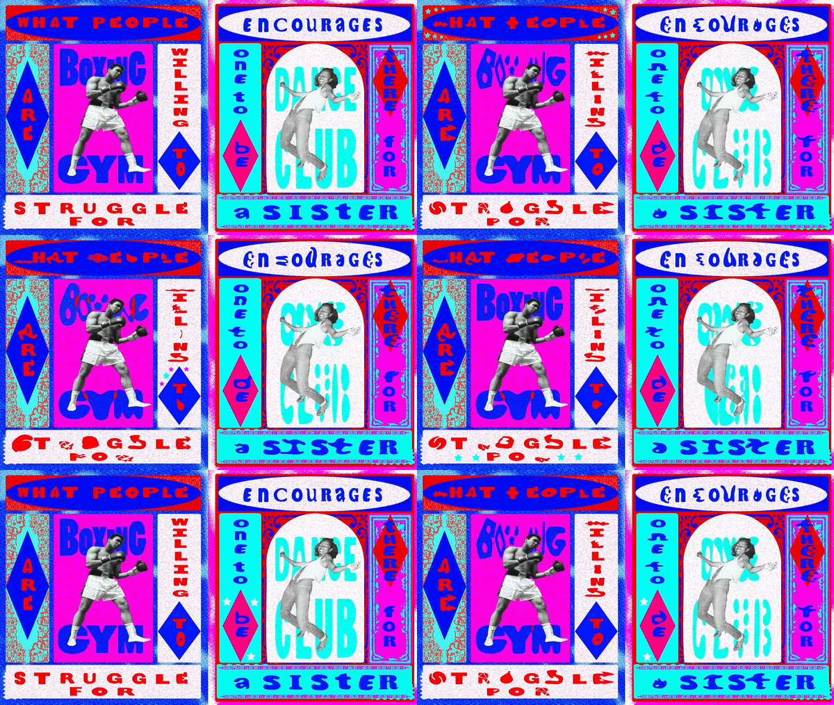
Animated layout test
I decided to test out the suggested layout of combining both posters into one. Initially, I found it interesting, but after much consideration, I chose to stick with two separate animated posters. The combined layout made the text read as "what people encourages" and "struggle for a sister," which worried me as it could cause misunderstandings. Adding stars next to the text to guide the reading felt like "cheating," as graphic design should be readable without additional help.
I wanted the posters to represent the clubs themselves while showcasing their similarities and differences by being displayed next to each other at the exhibition. Additionally, the posters looked "squished" when placed together. Therefore, I decided that keeping them as two separate animated posters would be more effective and visually appealing.
Audio Inspiration
Fred Again - Marea (We’ve Lost Dancing)

Berlioz - Miro

I was inspired by songs which use examples of real-life situations, translating them into danceable music pieces. I particularly enjoy how Fred Again sampled an authentic audio from an interview with Marea during COVID-19 for his song from the 2020 album "Actual Life." He re-uses audio, gives it new meaning, and creates deep house tracks that resonate with listeners. Indeed, the song is about the loss of dancing with one another during Covid but is poignant through a danceable song.
Similarly, I aim to give my audio an authentic feel by using excerpts from Jas and Darren’s interviews, sampling them, and creating a narrative between both.
I was also inspired by Berlioz’s music, especially the song "Miro" (2023) which uses a similar technique as Fred Again, by sampling interviews and audios and layering them onto jazz music. "Miro" tells the story of the artist struggling to find his voice, who, after receiving advice from Picasso "Get in line, wait your turn, just pretend you are waiting for the subway" continues his artistic path and succeeds. This approach is truly inspiring for artists today, encouraging spontaneity, creativity and persistence to create pieces “surreal, more real than reality itself”.
I want my audio to be similarly inspiring, showcasing how boxing and dancing can empower people and build communities. By blending authentic interview excerpts, I hope to create a narrative that highlights the transformative power of these activities.
Audio Process
Boxing audio / Interview with Darren


Dancing audio / Interview with Jas


Sampling audio / creating lyrics


Audio Chosen
Final audio

Song rights
I decided to look at the transcribed interviews that I had done during the last term with Darren Hamilton, my boxing trainer, and Jas Haque, my dance teacher. I picked out quotes that I thought were interesting and removed the background audio from the interviews to be able to sample them. I chose quotes that showed the similarities between both: what dancing and boxing mean to them to give context to the audio. I wanted to represent how it can empower, how it has helped them in their lives, and how the sports can be for anybody. Also, how it can express people's individualities. I wanted to show their similarities and transformative powers.
I then created lyrics using the quotes that I had picked. I wanted them to link with first Darren speaking and then Jas speaking to make it look a little bit like a discussion. I also wanted to add a background sound to it, and I chose to sample the liquid jungle song "Deep Love" by Dillinja & Mystery because I believe that it fits both clubs. By juxtaposing these quotes with the song using adobe audition, I wanted it to be dynamic and rhythmic just like the movements found in the gym. I also wanted it to be inspirational, just like Miro’s song, to encourage people to join these clubs
Static Posters
Inspiration

Kulachek, A. (2020). Strelka Bar.

Van Halem, H. (2024). Gallery Block C.

Bezik, V. (n.d.). Ssultry & Pornfilmfestival Berlin
For the creation of the static boxing and dancing posters, I was inspired by designs that use playful typography to make the visuals more expressive. During the last term, I came across the work of Van Halem (2024) for Gallery Block C in Groningen, Netherlands. Her use of lines creates the illusion that the text is being pulled in a specific direction, enhanced by vibrant riso colours that seem to draw viewers towards the gallery. I also enjoyed Kulachek’s (2020) poster design, which uses geometric shapes to sharpen and highlight the text, this resonated with me as I wanted to convey my message without relying on illustrations. Additionally, I explored Bezik’s (No date) work for the Ssultry & Pornfilmfestival, where the text appears to glitch or disappear, mimicking the ones often seen on screens.
The way these artists play with movement by stretching or layering text with geometric shapes inspired my own poster designs. Their work shows how to create a dynamic sense of motion and direction through static posters.
Static Posters Process
Additionally, I created three posters for the dance club using quotes from my interviews, such as “We are in a place of agency,” “Express that which I cannot articulate in words,” and “The more we dance, the more we share our communities.” For the boxing gym, I made three posters with quotes like “The discipline and drive is what keeps me moving forward,” “It’s You Vs You,” and “Developing something your own is a form of self-expression.”

Dance poster


Dance poster


Dance poster


Boxing poster


Boxing poster


Boxing poster
I started by sketching the designs in my sketchbook, using the custom typefaces I created for both clubs. Once I had the initial concepts, I redrew them in Illustrator, experimenting with placement and layout to capture the distinct atmospheres of each club. My goal was to reflect the environments of both the boxing gym and the dance class, mirroring the inspiring posters that fill their walls.
For the dance posters, I wanted to convey the lively, jiggly, and fun energy of Jas’s dance class. I began by sketching out the designs as a whole, then moved to Illustrator, where I played with the placement and layout to capture that free-spirited atmosphere. I aimed for shapes and forms that felt loose and dynamic, almost like street art, to reflect the playful nature of the dance club.
In contrast, for the boxing posters, I focused on structure and order. I skipped the sketchbook for this part, going straight to Illustrator to design directly on the computer. The geometrical shapes and rigid placement were meant to echo the seriousness and discipline of the sport.
I wanted the posters to be readable but also a bit challenging, encouraging the audience to spend more time engaging with them, much like the experience of being in the club itself. To ensure this balance, I received feedback from my peers, asking whether the posters were clear enough, and made adjustments based on their input.
Finally, I decided to use the same color scheme as the zine and animated posters to create a cohesive look throughout the exhibition.