Experimentation
Letterpress
Workshop


Letterpress Workshop
Letterpress Workshop
I started by testing the letterpress machine, as understanding the history and mechanics of graphic design felt important to me. I wanted to understand how the graphic design process works tactilely. It was essential as it enabled me to truly grasp the concept of grids and how they are organized into columns and rows of characters. During the letterpress workshop, I first started by finding what my text would be; I knew by this point that my developing practice would revolve around learning typography and graphic design as I wanted to try out a new mode of communication within the field of graphic art and I knew the subjects would revolve around Boxing, dancing and communities. I decided to use some of the text I have used in my manifesto as it relates to my practice in a fun way: “Maximalism is my Mantra. Fill in that negative Space”. I decided to use the “36 Caslon Bold” font as it is bold and confident, reminiscent of the fonts on boxing posters. It enabled me to see how different modes of alignments can convey certain words in the text that I had letter pressed: “Maximalism is my mantra. Fill in that negative S P A C E” It forced me to think of being more innovative and think of new ways of creating when it is can be more limited. This whole process was long but very satisfying in the end. Looking at the different fonts and the “personality” that they have helped me understand how they can reflect on the dynamism of the sport. Experimenting with the spacing was also interesting as it brought forward the fact that the composition of a typography can also evoke a motion without it specifically “moving”.
Textile Screen Printing
Workshop


Textile Screen Print Workshop
Textile Screen Print Workshop
I decided to learn how to print my designs on fabrics because the things people wear in boxing and dance gyms are essential to their identity. To prepare for the workshop, I decided to create something more related to the field of dance. I felt inspired by David Bowie’s song “Let Dance” (1983) and decided to use one of the lyrics for the song: “Put on your red shoes and dance the blues”. And the title “Let’s Dance”. I decided to use a Western-style font for the typography because it is heavyweight and bold, representing its dynamism. I felt that its flowing lines and curvature also represented the dancing rhythm. I then illustrated things such as a band playing instruments, which seems like they come from another era, which can remind one of the long histories of dance and how it always brought people together. I also wanted to add a modern style, such as a mouth with teeth jewellery on it stating, “Let's dance,” which is more reminiscent of a trend in the modern era.
I wanted the illustrations to have a mixture of contemporary and vintage feels to show how it will always be an essential part of our culture. I was firstly interested in seeing how this illustrative and typographical work would translate into tee shirts and sweatshirts. This workshop was also helpful as it taught me a new method of using illustrations and typography by intersecting design and textiles, which I truly enjoyed. Later, I decided to return to the sweater I had made to add a few more elements of design to it, including illustrations that could also relate to boxing. I re-drew one of my favourite collaborations from Andy Warhol and Jean Michel Basquiat, photographed by Michael Halsband from 1985, as I wanted my screen-printed textiles to have a bit of a pop art feel. It is a bit of a tricky concept to mix two completely different sports. In the end, I realised that I had returned to placing illustrations as the centrepiece of my work. Moreover, it was not my aim for this term; I wanted to delve into another art form.


Textile Screen Print Fail
Textile Screen Print Fail
Jas Dancing in Design
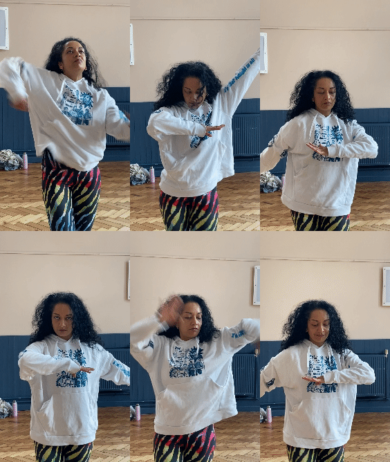
I ironed the white sweatshirt at home in order to set the ink but I had forgotten to place a piece of parchment paper onto it so it smudged onto the back. Some of the designs had also failed as the ink had smudged too much, so I decided to add a few touches of ink with a paintbrush, but I feel that I had made it worse and realised that when it comes to textile screen printing, it is the mistakes that also add the charm to the designs. In the end, I realised that this process would not translate well into how to make typography dance, as I had asked Jas to dance with the sweater on to see but the concept did not resonate well. Ultimately, this experience enabled me to try out a new artistic medium, which I believe I could genuinely enjoy if I took the time to work with it, as it is an exciting way to bring out my artistic practice. However, it does not translate into my professional practice as I am now more interested in the digital aspects of design.
3D Typography
Workshop


3D Type Workshop
I experimented with the 3D printer to see how It might translate typography into a multi-sensorial experience. It benefited my research, as I had to create my own written typeface, which I had never done before. I found it challenging initially because I needed to decide how to proceed. I decided to create a wobbly and funky font reminiscent of my personal style for the word “Gosh”. I then had to photograph my written typeface and place it in Illustrator to redraw and reshape it. This was also my first time using Illustrator, and it made me realize how useful it is. Honestly, I was never really attracted to this software as I believed it made designs look “corporate”. However, this experience opened my mind, and it is not easy to grasp. It can still look personal, and having perfect shapes is nice, but it also looks more professional. When the design was finalised and printed, I enjoyed looking at it and touching it. I am not sure that the whole process was something I was genuinely interested in, but I found it exciting to try out new ways of creating. I thought it was also good to know the whole process, from Illustrator to dismantling, reshaping, and making the 3D font on Rhinoceros Software to prepare the font for printing as it might be something that I could be asked to do in my professional practice.


Dancing
Boxing
Testing typefaces
Dancing
Boxing
I first started experimenting with typography for dancing and started imagining how certain letterforms might be reminiscent of dancing movements. It tried to make them more flowy, like the dancing movements during the global dance class. I wanted to infuse the letters with a sense of freedom, reminiscent of how Jas lets us freestyle during class. To do so, I avoided sharp lines and brought forward a more organic feel to the letters.
However, during our group feedback session on March 27th, I showed my experimentation, which had reached the letter G. Harriet brought up the point that I am giving a literal interpretation to the letterforms. I am drawing the letters as they are seen in the alphabet, constraining myself, and I should try to be more playful and abstract.
I find it challenging to design letterforms after a lifetime of perceiving them in a certain way, so breaking free from their familiar shapes has been mentally challenging. I decided to follow the advice of the designer Pavel Alekseev (Murphy, Alekseev, 2021, online) who suggests making a sketchbook page of typography every day: 'Just like a morning workout, or yoga, or mental practice, or even a cup of coffee' he explains, 'it helps me to reduce stress, change point of view and keep my skills and imagination in good shape'. So, I decided to design typography for a whole week, and it is true that when I got to the boxing typography, I started letting loose and being more playful with the designs.
Perhaps because I was sick of drawing letters at this point, I wanted to finish them faster, so I drew them with no pressure. The typography for the boxing felt easier to design also because it was more inspiring to me; I feel that there are more things to draw from it when I think of boxing, I can hear the sounds that come out from it, the bang bangs, the punches, the low, the blows. The wind from the punches could be reminiscent of swirls in my brain. The letters should be more angular and have stricter shapes reminiscent of the strength and hardship of learning the sport.
For the dancing typography, the letterforms were inspired by Indian typography, which seems more natural and looser. I also gave it qualities of plants as they are freer flowing. For the typography of the boxing, I was inspired by looking at Onomatopoeic expressions found in comic strips.
It was interesting that boxing felt easier to design than dancing, perhaps because it seemed more restrictive. Also, I think of more objects when I think of boxing, whilst the dance classes do not have as many (except for gym clothes, shoes, and Jas's boombox.)
I then showed my typography designs to some classmates and asked them to tell me which designs embodied dancing and boxing. The boxing typography seemed evident to them because the zig-zag circles were reminiscent of the comic strip onomatopes. However, the dancing typography was not as much as it could have been reminiscent of the boxing movement for some students. Overall, I prefer the typography that I have done for boxing here as it is more abstract and playful, whilst the dancing typography does not feel as original.
Screen Printing


Screen-print tests


Dancing
Boxing

Final Print
I decided to experiment with creating posters which could express the non-verbal communication found in the dancing and boxing gym and how I could convey the dynamism and movements found in these spaces in a still way. I decided to challenge myself by creating the screen-prints entirely using Illustrator. I want to learn how to use this software, and it is also essential to have it in my portfolio.
I decided to create two posters using some of my interview answers from the members of the gyms. The theme here was to define what boxing and dancing means to them. For boxing, I chose the sentence, “It defines me; discipline and drive keep me moving forward.” For dancing, I chose the sentence “Expressing that which I cannot articulate in words”. I enjoy how they represent both cultures within the sports; the dancing one is more poetic and relaxed, whilst the boxing one has a more serious tone.
I then redrew some typefaces I created, representing the dancing and boxing movements. I wanted the work to look more conceptual but also in a way in which it does not have to indeed be readable to represent what it means to people in a personal way. It is not told, but it is known to them. I wanted the dancing poster to have a wavier feel reminiscent of the arm and leg movements whilst dancing. For the boxing one, I decided to take my concept further and create a sort of boxing hieroglyph. The typefaces represent the act of boxing conceptually but also bring forward the seriousness of the sport. In a way, it seems to be a secret manuscript that belongs only to the members of the gym, representing the codes and values embedded in them, which can’t be understood by people who do not belong to these communities.
I created a background reminiscent of the heart cell sound waves produced by Utkan Demirci and Sean Wu (2017) for the dancing screen-print. I wanted to bring forward how the movements increase one’s heart rate. I felt that sound waves would be too much for the boxing one as the hieroglyphs looked like drawings themselves. So, I decided to create straight lines reminiscent of the boxing ring. I then separated the layers and screen-printed them in red and yellow, which I found empowering colours reminiscent of sports. I was not too pleased by the results as the lines are not perfect on the final screen-print, but maybe it could also represent the more humane aspect of it. Overall, I found this concept interesting, but I was unsure if it genuinely encapsulated my idea, as I do not believe someone would be able to determine the subject here.
Movements

Boxing Movements

Dancing Movements
Looking at cymatic experiments inspired me to create my own more conceptually. I first started thinking about words centred around the themes of movements embedded within dancing and boxing; for the boxing, stronger, unbreakable, jumping, sharp, focused, blood pumping, jab, cross, left hook, right uppercut and how I could go about representing them in a more conceptual rather than literal way. For dancing, the words that came up were frequencies, strength, vibration, rhythmic, improvisation, imperfect, jumping, and release. I started drawing the words in the form of lines, which enabled me to think about how to animate my typefaces. I wanted to focus more on the flow and energy of the sports rather than the actual steps taken when someone goes to the gym.
Texture experiments
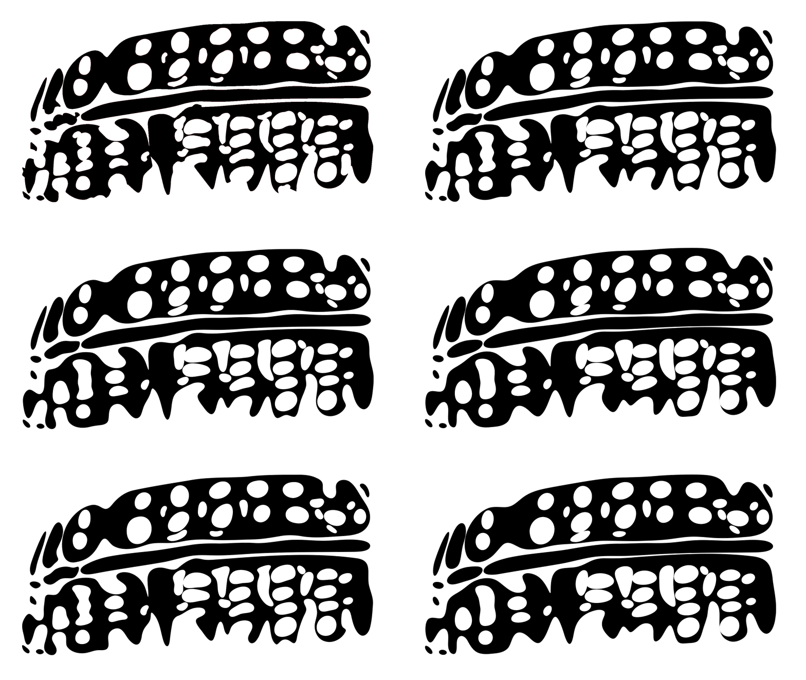
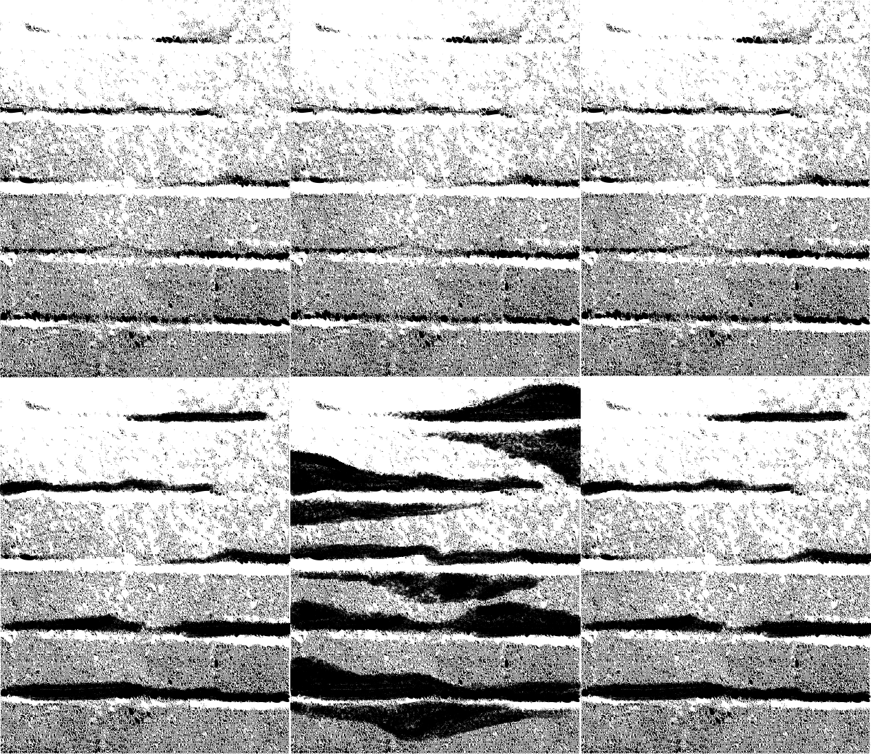

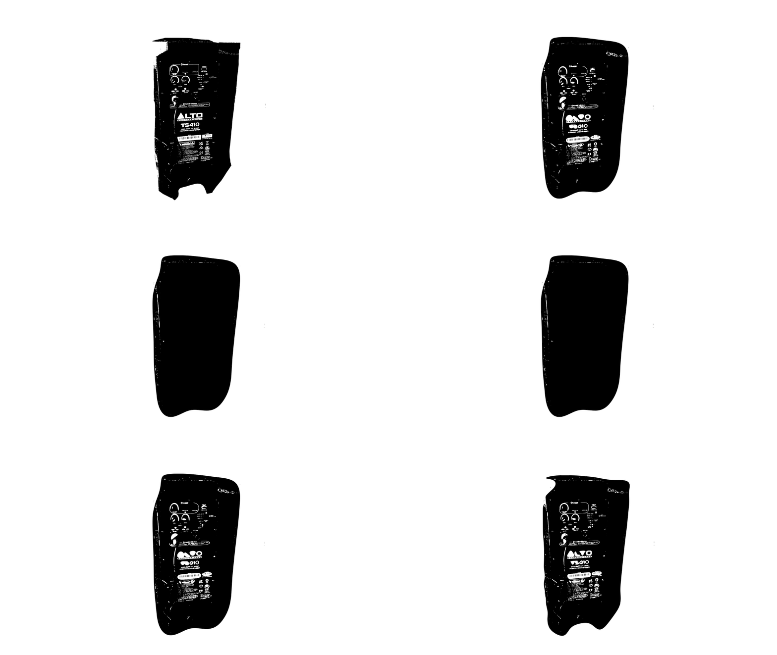
I decided to experiment with some of the textures found in the boxing and dancing club, such as the wheel, a glove from the boxing gym and a boombox and wall from the dancing club. I found that it could be interesting to bring maybe these textures found in the club inside of the typefaces.


I decided that I want to create an animated poster representing how dancing fosters a sense of community. I chose the sentence "It encourages me to be there for a sister" from the interview answers based on dancing. This sentence embodies how the dancing club is there to encourage sisters and be kind to one another. At the beginning of our class, we always get words of encouragement from Jas, telling us just to be ourselves and not to be afraid to appear "goofy". While we dance together, we share laughs, let go and have fun. When the class ends, Jas places tapestries on the floor so we can sit down, cool down, and chat. It also encapsulates the true essence of this class, which is centred around women. I enjoy this sentence as I find it moving, but also because this dance class can be like a chosen family for some. Inspired by Anna Mill's technique, I decided to create animations for every typeface and how I might see them move. I re-used the typefaces I had created and started drawing how I might see them dance. During this process, I kept looking at the video I had filmed during Jas's class. I wanted the letters to be more fluid, jiggle, and move their legs and arms. Sometimes, the letters become more humane, and they dance with their limbs. Sometimes, it would become more conceptual and jiggle like the body or become drops of sweat. I wanted the movements to encapsulate the club's mood, which is transcending, energetic, and all about improvisation.
Dancing Animatic
Animatic
Dancing Animation tests

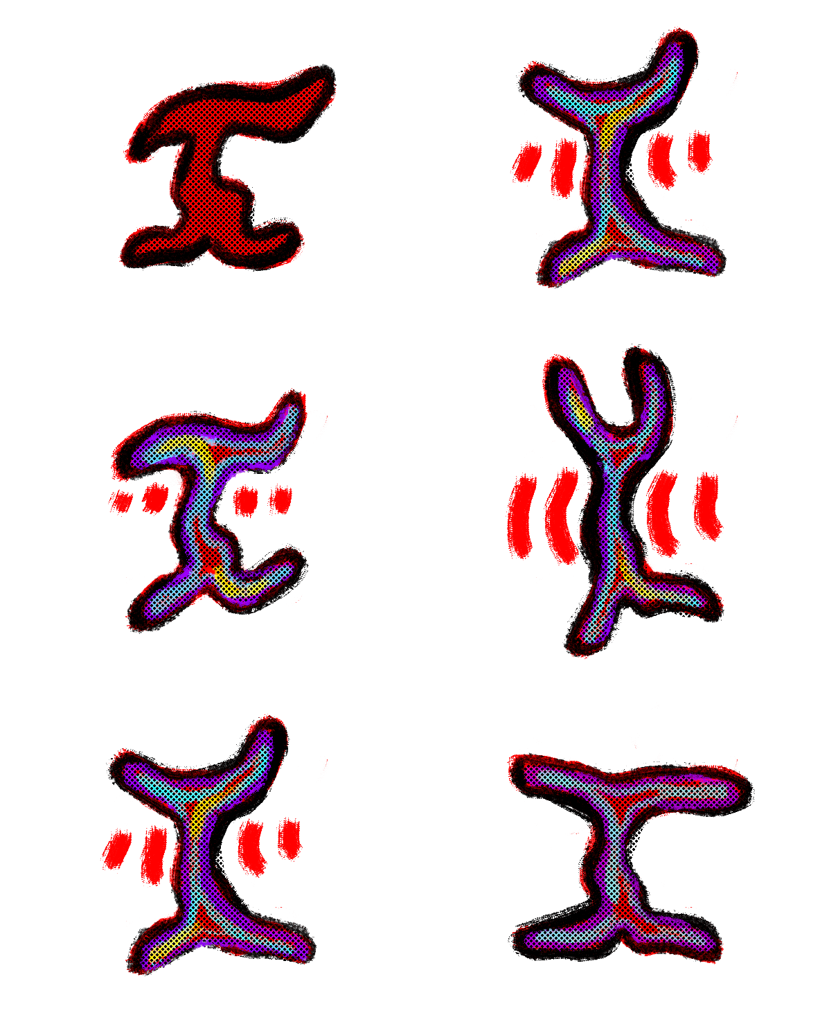
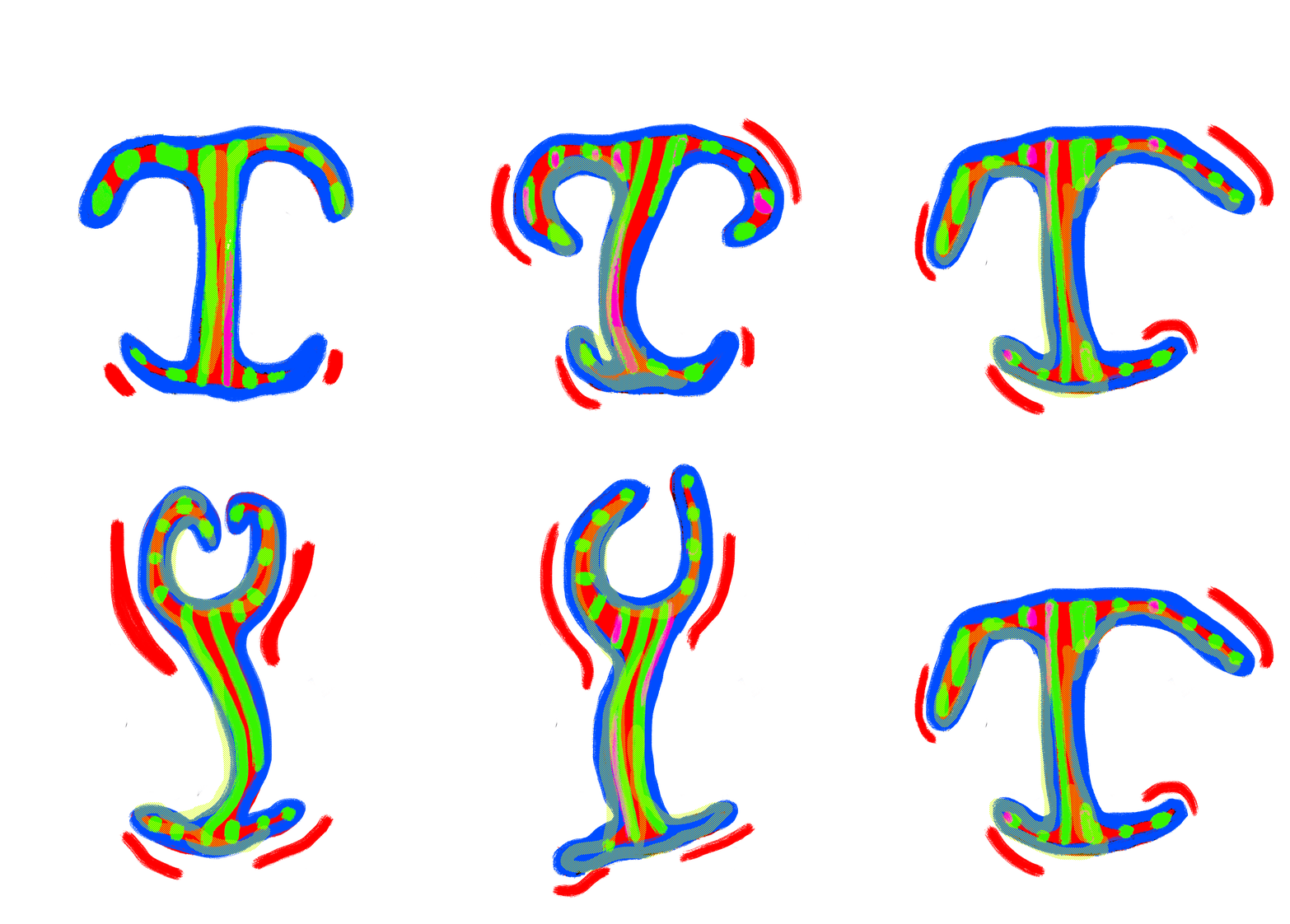
Animation tests


Frames made on Illustrator to paste on photoshop

Vintage ticket, Letterology.com
I started by creating frames in Photoshop while referring to the animations I had created. However, the frames for the dancing letters looked amateurish and could have been cleaner. I particularly enjoy the clean and tidy look in graphic design, so I decided to experiment with creating frames in Illustrator. I found that the outcomes had a more professional feel, which I enjoyed. These animation tests were invaluable to my research as they made me realize that this is the medium I want to use for the final project, and I really enjoyed the process. I believe that using animation as a medium, could be an original way to encapsulate the true essence of the dancing club. I decided to play with colours and textures within the designs, which I will incorporate into my final outcome. I will also try to limit the colours and not use as many as in the test, as it is too much. I started to test if I could create the full gifs in Illustrator, but I found it better to create the frames in Illustrator and then paste them onto Photoshop as the tool is better. I will be redoing the ones I have made in Photoshop and Illustrator to give them a cleaner feel. They encapsulate the true essence of dancing. I also enjoy blending designs with a more human aspect to them and others with a more conceptual aspect to them. This process also made me realize that I want to keep the true essence of the typeface readable to the audience. It is more attractive as it brings forward the double meanings of the sport. I enjoy the gifs I made but will be redoing the ones I have made in Photoshop and Illustrator to give them a cleaner feel. They encapsulate the true essence of dancing. I also enjoy blending designs with a more humane aspect to them and others with a more conceptual aspect to them. This process also made me realize that I want to keep the true essence of the typeface readable to the audience. It is more attractive as it brings forward the double meanings of the sport. I also need to consider the spacing of these typefaces within my final design, and similarly to the dancing video maybe make them flow into each other in a way.
I also posted it on my Instagram story with a sound which made me realize how important it is to convey the true essence of the sport. However, I was unsure if it would simply be a song used during the class or if it could even be overlayered with Jas’s words guiding us and could provide some context. It could also enhance the experience for the visitor.
This made me realise how cool it would be to have a poster projected on a wall resembling a vintage membership card or ticket for a dance club with the letters dancing. I believe it could bring forward this idea of the club metaphorically, which is only accessible to its members.
Boxing Animatic


Animatic


I also want to create a poster based around boxing and communities and chose the interview answer: “It allowed me to see what people are willing to struggle for”. I believe that it genuinely encapsulates the seriousness of the sport, although it may have a more intense tone to it. I decided to make the typefaces move in a more aggressive, quick, pivotal way. While creating these animations, I would rewatch the boxing videos to find inspiration. Sometimes, I would transform the letters into symbols seen in the boxing gym, such as the punching bag. Or give them a similar look to the onomatopoeias for impact, which are often seen in comic books. In a way, I want to bring forward the mental and physical endurance that the sport entails.
Boxing Animation Tests

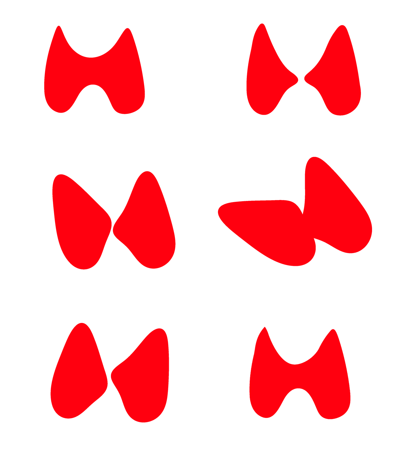
Animation Tests
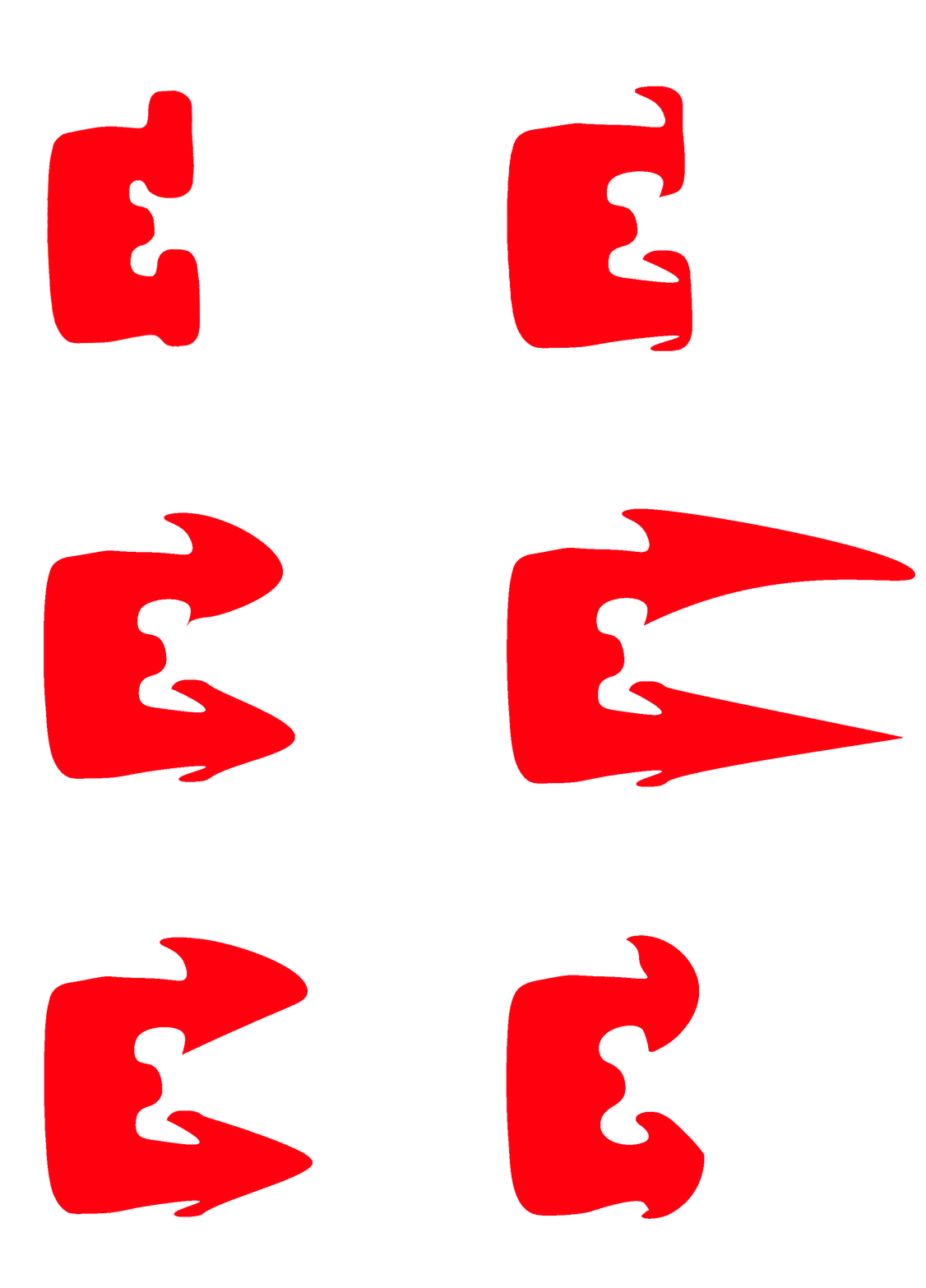


Frames made on Illustrator to paste on photoshop


Huggins & Scott Auctions

Huggins & Scott Auctions
Gene Tunney v Jack Dempsey Long Count
9/22/1927 Boxing Ticket
I continued creating animations using the same method as the dancing animations. The boxing typefaces really capture the essence of boxing here more conceptually. This made me think it would be more interesting if the fonts were entirely conceptual rather than human-looking. I wanted to make the fonts fight, transform into a punching bag, become a strange blood blub or simply extend in a similar way to the arms when pushing, bringing forward the force of the sport. The spacing of these typefaces maybe should be more distanced in a way reminiscent of the individualistic side of the sport. Also I could maybe add more slang, maybe more informal ways of speaking similar to the rawness of how boxers talk after a fight.
I think I also want to remake some of these designs and make them look even more abstract and reminiscent of my own personal style and the typefaces that I have drawn in my sketchbook.
Seeing the typefaces here made me realize their potential of being placed on what could look like a vintage boxing ticket, perhaps where the boxing typefaces could replace the actual text. It could bring forward the nostalgic and traditional aspect of the sport. I also started thinking about the sounds omitted within the boxing gym: the strange grunts, the ring sound, the orders given, and the usual rap songs. It should be a blend to capture the true essence of the sport while the poster will be projected on the wall.
Audio Test

I decided my animated posters would need audio, so I started experimenting with sound recordings from the boxing gym on Adobe Audition. I kept parts of the audio where my trainer Darren yells, "Keep going, Keep pushing", "Plank", "Challenge yourself, challenge your mind" but also certain sounds such as the bell ringing and punching bag. I placed it above the hip-hop song from Mobb Deep's "Shook Ones Part II" (1994), a very intense song about street survival usually played at the boxing gym. This song is the true embodiment of boxing and its history and how it has helped in the fight against crimes, gangs, drugs, and poverty in the streets. (Wacquant, 2004, p.35)
I tried to remove any sounds from the background, such as wind, mouth clicks, and background noise on Adobe Audition. I also tried to enhance the vocals. However, this made me realize the potential of perhaps creating a sound for the dancing and boxing gym using the voices and sounds found in the boxing (bell ringing, punching, grunts, etc.) and dancing gym (foot sounds, grunts, Jas telling us what steps to take) in order to bring forward their atmospheres.